7 Powerful Business Intelligence Dashboard Examples for 2025
- Sep 1, 2025
- 17 min read
In today's data-saturated environment, the ability to transform raw numbers into a clear, actionable story is no longer a luxury-it's a competitive necessity. Business intelligence (BI) dashboards are the command centers where this transformation happens, offering a visual snapshot of your organization's health, performance, and opportunities. The challenge isn't just collecting data; it's presenting it in a way that drives smart, swift decisions.
But how do you design a dashboard that truly empowers decision-making instead of just adding to the noise? The answer lies in studying the best. A truly effective dashboard cuts through the complexity, allowing teams in logistics, technology, and operations to synchronize workflows, automate processes, and optimize resource management without getting lost in spreadsheets. For more inspiration and practical insights, you can explore these 7 Top Business Intelligence Dashboard Examples for 2025 for a deeper look at what high-impact designs achieve.
This guide dives deep into powerful business intelligence dashboard examples from leading platforms like Tableau, Power BI, and Google Looker Studio. We'll go beyond the surface to analyze the strategic thinking behind each one, breaking down their key metrics, design principles, and the actionable takeaways you can apply to your own analytics projects. Each example includes screenshots and a strategic breakdown to provide the inspiration and practical guidance needed to build dashboards that drive tangible results.
1. Tableau
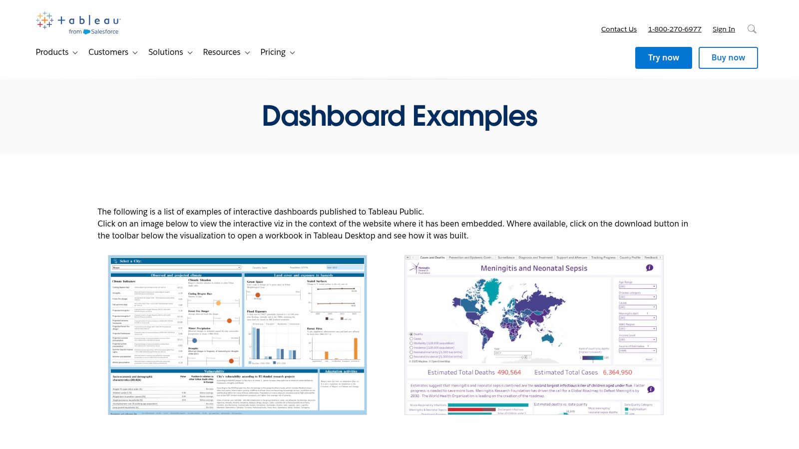
Tableau stands out not as a single dashboard example but as a comprehensive and interactive library of thousands. Its Tableau Public gallery and curated Dashboard Showcase offer an unparalleled resource for anyone looking to understand the art and science of data visualization. It's an ideal starting point for exploring diverse business intelligence dashboard examples across nearly every industry imaginable, from healthcare analytics to financial services and retail sales.
The platform’s core strength lies in its community-driven, hands-on approach. Unlike static image galleries, many dashboards on Tableau Public are fully interactive. Users can click, filter, and drill down into the data, experiencing firsthand how a well-designed dashboard facilitates discovery. This interactivity is crucial for understanding the user experience and the narrative flow of data analysis.
Why It's a Top Resource
What makes Tableau an essential resource is the ability to download the underlying workbook for many of the visualizations. This allows you to reverse-engineer the dashboard, inspect the data model, understand the calculations used, and see exactly how the designer configured the charts and interactivity. It's like having the blueprints to a masterpiece, offering a deep learning experience that static examples can't match. Exploring these workbooks can provide a solid foundation if you are just starting to learn about the key insights and benefits of business intelligence dashboards.
Strategic Takeaways & Practical Tips
1. Use the "Viz of the Day" for Inspiration:Tableau's daily feature, "Viz of the Day," showcases exceptional work from the community. Following this is a simple, effective way to stay updated on innovative design techniques and compelling data storytelling.
2. Filter by Industry and Department:Don't just browse aimlessly. Use the gallery's powerful search and filtering capabilities to find dashboards relevant to your specific needs, whether it's marketing campaign analysis, supply chain logistics, or human resources performance. This focused approach helps you find replicable metrics and layouts.
3. Deconstruct Downloadable Workbooks:Prioritize examples that allow you to download the workbook ( file). Open them in the free Tableau Public desktop app to study:
Calculated Fields: Understand the logic behind custom metrics.
Dashboard Actions: See how interactivity (filtering, highlighting) is implemented.
Data Source Structure: Analyze how the raw data is organized for visualization.
Feature | Availability & Access | Best Use Case |
|---|---|---|
Dashboard Gallery | Free, no paywall to view and interact | Gaining inspiration and understanding best practices in UI/UX design. |
Workbook Downloads | Available for many, but not all, public dashboards | Deep-diving into the technical build and reverse-engineering logic. |
"Viz of the Day" | Free, featured on the main public page | Staying current with innovative data visualization trends. |
This platform is less a single example and more an entire educational ecosystem. Its value comes from active exploration, making it a must-visit for anyone from a BI beginner to a seasoned analyst looking for fresh ideas.
2. Microsoft Power BI
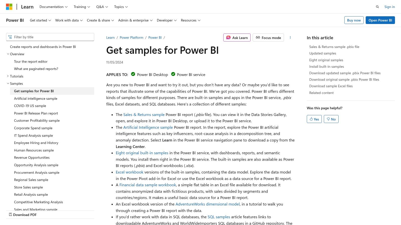
Microsoft Power BI offers a highly practical and structured approach to learning through its official sample reports and datasets. Unlike purely inspirational galleries, Power BI provides downloadable files directly integrated with its learning documentation. This makes it an exceptional resource for those who want to move from theory to practice, offering ready-to-use business intelligence dashboard examples for sales, marketing, finance, HR, and more.
The platform's strength is its dual offering of official learning samples and a marketplace of partner-built Template Apps. The official samples are perfect for beginners who want to follow guided tutorials, while the AppSource gallery provides turnkey dashboards that connect to common data sources like Salesforce or Google Analytics. This allows users to quickly deploy sophisticated reports and then customize them to their specific business needs, significantly speeding up the development process.
Why It's a Top Resource
Power BI's key advantage is its integration within the broader Microsoft ecosystem and its focus on actionable deployment. The ability to download files allows you to dissect every element of a report in the Power BI Desktop application, from the Power Query transformations and DAX measures to the report layout and visual formatting. This hands-on approach is invaluable for understanding the end-to-end process of BI development. You can find more details in this business intelligence software comparison guide that covers Power BI in depth.
Strategic Takeaways & Practical Tips
1. Start with the Official Samples:Begin with the samples provided on the Microsoft Learn website. These are designed as teaching tools and come with full documentation explaining the data story, the metrics used, and how the report was built. This is the best way to grasp foundational concepts.
2. Explore AppSource for Turnkey Solutions:Browse the Power BI Template Apps on AppSource. Filter by business function (e.g., "Marketing") or data source (e.g., "Mailchimp") to find pre-built dashboards. Installing these into your workspace is a fast way to get a professional-grade dashboard connected to your own data.
3. Reverse-Engineer the Data Model:Once you download a file, don't just look at the visuals. Go to the "Model" view in Power BI Desktop to study:
Table Relationships: Understand how different data tables are connected.
DAX Measures: Analyze the formulas used to create key performance indicators (KPIs).
Power Query Steps: Review the applied steps in the Power Query Editor to see how the raw data was cleaned and transformed.
Feature | Availability & Access | Best Use Case |
|---|---|---|
Official Samples | Free, downloadable files from Microsoft Learn | Learning foundational BI concepts and reverse-engineering best practices. |
Template Apps | Free to install; requires Power BI Pro/Premium for sharing | Rapidly deploying professional dashboards connected to standard business apps. |
Community Gallery | Free, features user-submitted reports | Discovering creative visualization techniques and industry-specific designs. |
By combining structured learning resources with deployable app templates, Microsoft Power BI provides a complete ecosystem for both learning the craft and delivering immediate business value. It is an essential stop for anyone building their BI skills on the Microsoft stack.
3. Google Looker Studio
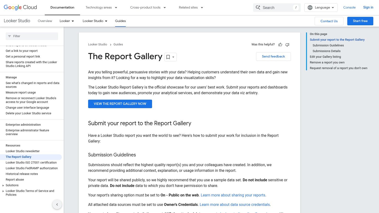
Google Looker Studio (formerly Data Studio) serves as an accessible and powerful resource, especially for businesses deeply integrated with Google's ecosystem. Its Report Gallery is a curated collection of templates and user-submitted dashboards, making it one of the best places to find functional business intelligence dashboard examples that are ready to be used almost instantly. It's designed for rapid deployment, allowing users to connect their own data sources and generate live reports in minutes.
The platform's primary advantage is its seamless, no-cost integration with Google products like Google Analytics, Google Ads, and BigQuery. The templates in the gallery are not just static images; they are fully functional reports that can be copied with a single click. This functionality empowers users to quickly visualize their own data using a proven, professionally designed layout, which dramatically lowers the barrier to entry for creating effective BI dashboards.
Why It's a Top Resource
What makes Looker Studio a standout resource is its combination of zero cost and immediate utility. The one-click "Use template" feature is a game-changer for small teams and marketers who need to produce high-quality dashboards without a steep learning curve or software investment. You can go from seeing an example to having a fully functional, personalized dashboard connected to your live data in less than five minutes. This speed from inspiration to implementation is unmatched, especially for common use cases like marketing performance or website analytics.
Strategic Takeaways & Practical Tips
1. Start with Official Google Templates:When working with Google data sources (like GA4, Google Ads, or YouTube Analytics), begin with the templates created by the Looker Studio team. These are optimized for the specific data structures and provide a reliable foundation that adheres to the latest data visualization best practices.
2. Leverage the Community Gallery for Niche Ideas:Explore the public Report Gallery to see how other users are solving unique problems. You can find dashboards for everything from SEO keyword analysis to e-commerce funnel tracking. These examples often showcase creative uses of charts and data blending that you can adapt for your own needs.
3. Use Templates as a Learning Tool:After copying a template, enter "Edit" mode to deconstruct it. This is a fantastic way to learn:
Data Source Blending: See how the creator joined data from different sources, like Ads and Analytics.
Custom Formulas: Examine the calculated fields to understand how new metrics were created.
Filter and Control Setup: Analyze how interactive elements like date ranges and dimension filters are configured to create a dynamic user experience.
Feature | Availability & Access | Best Use Case |
|---|---|---|
Official Templates | Free, requires a Google account | Rapidly creating dashboards for Google products (GA4, Ads, BigQuery). |
Community Gallery | Free, publicly accessible to browse and copy | Finding creative solutions and niche dashboard designs from other users. |
One-Click Copying | Free, built-in platform functionality | Prototyping and deploying customized dashboards with your own live data. |
Looker Studio's gallery excels at providing practical, actionable templates rather than just conceptual inspiration. Its value lies in its speed and deep integration with the Google marketing and analytics stack, making it an essential tool for digital-first businesses.
4. Qlik
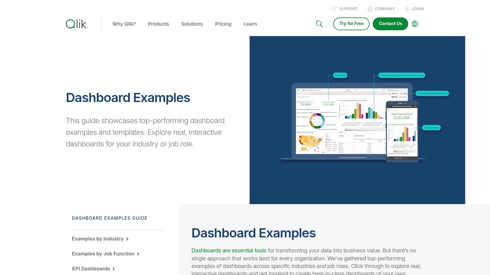
Qlik offers a comprehensive gallery of dashboard examples that serves as a powerful showcase for its analytics platform. Rather than just a collection of static images, the Qlik hub provides over 100 interactive, role-specific, and industry-focused dashboards. This resource is exceptionally useful for business leaders and analysts looking to understand how modern BI can solve specific, real-world challenges, from optimizing a supply chain to analyzing customer profitability.
The platform's examples are designed to highlight its unique associative engine, which allows users to explore data freely without the constraints of linear, query-based models. Many of the demos feature interactive elements, AI-driven insights, and even conversational analytics, providing a forward-looking view of what business intelligence dashboard examples can achieve. This makes it a great resource for seeing advanced BI capabilities in action.
Why It's a Top Resource
What sets Qlik's gallery apart is its focus on guided analytics and modern BI patterns. The examples are not just visualizations; they are complete analytical applications. Each dashboard is often accompanied by a demo video that walks users through a specific analytical workflow, explaining how to uncover insights using features like AI suggestions. This educational approach helps bridge the gap between seeing a dashboard and understanding how to use it strategically for decision-making.
Strategic Takeaways & Practical Tips
1. Focus on Role-Based Dashboards:Instead of browsing generally, use the filters to find dashboards designed for a specific job function, such as "CFO," "Sales Manager," or "Supply Chain Analyst." This allows you to see the exact KPIs and layouts that are most relevant and effective for a particular role, providing a practical template for your own projects.
2. Watch the Demo Videos for AI Features:Pay close attention to the demo videos that showcase Qlik's AI and conversational analytics. Observe how a user can ask natural language questions or receive automated insight suggestions. This can inspire you to think beyond traditional charts and incorporate more advanced, user-friendly features into your BI strategy.
3. Analyze the Associative Experience:When interacting with the demos, notice how filtering one chart instantly updates everything else on the page, including data that might seem unrelated. This is Qlik's associative model at work. Understanding this concept can help you design more intuitive and powerful dashboards where users can explore data relationships from any angle.
Feature | Availability & Access | Best Use Case |
|---|---|---|
Dashboard Examples | Free to view and interact with online | Exploring industry-specific KPIs and best-practice layouts. |
Demo Videos | Freely available for each dashboard example | Understanding advanced features like AI insights and guided analytics. |
Product Trials | Links provided to sign up for a free trial | Recreating or building a similar dashboard using the Qlik platform. |
Qlik's gallery is more than a portfolio; it's a learning center for modern analytics. By focusing on the functional and interactive aspects of its examples, you can gather valuable ideas for building truly insightful and user-centric dashboards.
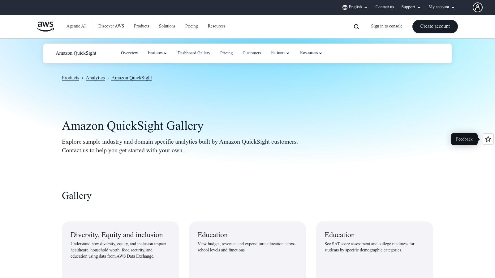
5. Amazon QuickSight
Amazon QuickSight's Dashboard Gallery is a curated collection of business intelligence dashboard examples specifically designed to showcase the platform's capabilities within the Amazon Web Services (AWS) ecosystem. It serves as a practical resource for teams already invested in or considering AWS for their data infrastructure, offering a clear view of what’s possible when connecting directly to services like Amazon Redshift, S3, and Athena. The gallery features dashboards across various industries, including finance, healthcare, and education, making it a valuable starting point for AWS users.
The gallery's main advantage is its focus on integration and domain-specific solutions. The dashboards are interactive, allowing users to apply filters and explore the visualizations firsthand, which provides a tangible feel for the QuickSight user experience. This is particularly useful for evaluating its embedded analytics potential, where dashboards are integrated directly into other applications.
Why It's a Top Resource
What makes the QuickSight Gallery an important resource is its direct alignment with the AWS data stack. For organizations running their data warehouses, data lakes, and analytics services on AWS, these examples demonstrate a native, seamless integration path. The dashboards are official AWS-vetted examples, providing a reliable benchmark for performance and design within that specific technological environment. They effectively illustrate how to build cohesive, end-to-end analytics solutions entirely within AWS.
Strategic Takeaways & Practical Tips
1. Align Examples with Your AWS Services:Focus on dashboard examples that connect to the AWS data sources you already use. If your data is in Amazon Redshift, for instance, prioritize the financial or sales dashboards that are likely built on a similar data structure. This helps you visualize a direct path from your data to a functional dashboard.
2. Evaluate Embedded Analytics Use Cases:Use the interactive dashboards to simulate the experience of an end-user within an embedded context. Assess the responsiveness, filtering capabilities, and overall clarity of the visualizations. This is crucial if your goal is to provide analytics within your own SaaS application or customer portal.
3. Use as a Design Guide for QuickSight-Specific Features:Pay close attention to how the examples utilize QuickSight-specific features like "Q" (natural language querying) or anomaly detection. These demos can inspire you to incorporate advanced, AI-driven functionalities into your own dashboards, which might not be as prominent in other BI tools.
Feature | Availability & Access | Best Use Case |
|---|---|---|
Dashboard Gallery | Free, no paywall to view and interact | Evaluating QuickSight's visualization capabilities within the AWS ecosystem. |
Industry-Specific Demos | Freely accessible on the gallery page | Finding relevant KPIs and layouts for a specific business vertical (e.g., healthcare, retail). |
Interactive Previews | Available for all gallery dashboards | Testing the user experience and interactivity of QuickSight filters and charts. |
The QuickSight Gallery is less about community-driven creativity and more about showcasing a polished, integrated analytics solution for the massive AWS user base. It is the go-to resource for anyone looking to understand and maximize the potential of business intelligence within the Amazon Web Services environment.
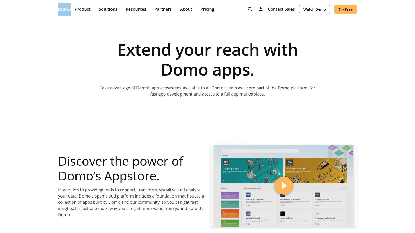
6. Domo
Domo positions itself as an accelerator for BI deployment, offering a rich Appstore filled with pre-built dashboards and customizable components. Rather than starting from a blank canvas, users can leverage hundreds of QuickStart apps and advanced visualizations called 'Domo Bricks'. This approach makes it a standout resource for teams looking to quickly deploy powerful business intelligence dashboard examples tailored to specific roles or industries.
The platform’s key differentiator is its blend of speed and customization. The Appstore provides ready-made solutions that connect to over 1,000 data sources, allowing for rapid deployment. For more unique requirements, Domo Bricks offer a high degree of flexibility, enabling developers to build custom visualizations using HTML, CSS, JavaScript, and popular libraries like D3.js, extending capabilities far beyond standard chart types.
Why It's a Top Resource
What makes Domo’s Appstore so effective is its focus on solving specific business problems out of the box. The apps are not just generic templates; they are fully functional dashboards designed for roles like marketing, finance, and operations, or for industries such as retail and manufacturing. This solution-oriented library drastically reduces the time from data connection to insight, providing immediate value and a solid foundation that can be customized later. Access requires a Domo subscription, making it a premium resource for existing customers.
Strategic Takeaways & Practical Tips
1. Start with Role-Based QuickStarts:Instead of building from scratch, browse the Appstore for a QuickStart app designed for your department (e.g., "Marketing Funnel Performance" or "Financial Close"). These apps come with pre-configured KPIs and visualizations, providing an 80% solution that you can then refine.
2. Explore Domo Bricks for Unique Visuals:If standard charts don't meet your needs, investigate Domo Bricks. You can find components for creating custom maps, Gantt charts, or specialized industry visuals. This is ideal for when you need a dashboard to communicate a very specific or complex data story that generic tools can't handle.
3. Leverage Pre-Built Connectors:The true power of the Appstore is unlocked when combined with Domo's extensive data connectors. Before building, check if there's a pre-built app for the software you use (e.g., Salesforce, Google Analytics, Shopify). Deploying one of these apps can give you a live, functional dashboard in minutes, not weeks.
Feature | Availability & Access | Best Use Case |
|---|---|---|
Business Solution Apps | Requires an active Domo subscription | Rapidly deploying role or industry-specific dashboards with pre-built logic. |
Domo Bricks | Requires Domo subscription; some may need developer skills | Creating highly custom, advanced visualizations beyond standard options. |
Data Connectors | Integrated into the platform for Appstore apps | Automating data pipelines to populate template dashboards with live data instantly. |
Domo's Appstore is less a gallery for inspiration and more a toolkit for rapid execution. It’s an ideal platform for organizations that want to standardize their reporting and deploy BI solutions at scale without reinventing the wheel for every department.
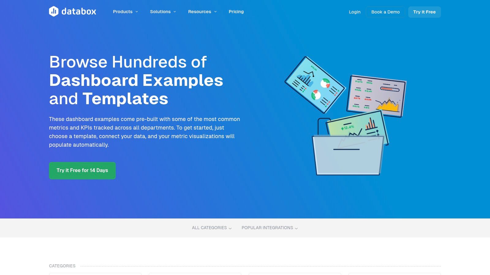
7. Databox
Databox offers a slightly different approach, focusing on speed and accessibility through its extensive library of over 300 pre-built dashboard templates. While other platforms showcase bespoke, complex visualizations, Databox excels at providing immediately deployable business intelligence dashboard examples for specific, common use cases across marketing, sales, finance, and ecommerce. This makes it an ideal resource for small to medium-sized businesses or teams that need to track standard KPIs without a lengthy development cycle.
The platform's strength lies in its plug-and-play nature. Users can browse templates by function (like SEO or social media) or by data integration (like HubSpot, Google Analytics 4, or Salesforce). This practical, tool-centric organization allows teams to find a relevant starting point quickly, connect their data sources, and have a functional dashboard live in minutes, not weeks. The experience is geared toward action rather than deep, exploratory analysis.
Why It's a Top Resource
What makes Databox a valuable destination is its focus on solving common business problems out-of-the-box. The gallery isn't just for inspiration; it's a functional catalog. Each template is designed around specific goals, such as monitoring a SaaS funnel, tracking ecommerce performance, or analyzing marketing-qualified leads. For teams without dedicated BI analysts, this templated approach provides a robust foundation built on best practices, ensuring they monitor the right metrics from day one.
Strategic Takeaways & Practical Tips
1. Filter by Integration, Not Just by Function:Start your search by filtering for the specific tools you already use, like Shopify, Salesforce, or Google Ads. This ensures you find templates that are not only relevant to your goals but also immediately compatible with your existing data stack, drastically reducing setup time.
2. Use Templates as a Foundational Layer:Don't view the templates as final products. Select a template that covers 80% of your needs and then use the in-app Designer (available during the free trial) to add, remove, or modify visualizations. This hybrid approach balances the speed of templates with the need for customization.
3. Analyze KPI Selections:Before building anything, study the KPIs included in Databox's templates for your industry. They have aggregated common reporting needs from thousands of users. This can help you validate your own KPI strategy and identify any critical metrics you might be overlooking.
Feature | Availability & Access | Best Use Case |
|---|---|---|
Template Library | Free to browse; requires account/trial to use | Quickly finding and deploying dashboards for standard business functions. |
In-App Designer | Available with free 14-day trial and paid plans | Customizing pre-built templates to match specific business requirements. |
Integration Filters | Freely accessible on the examples page | Finding dashboards that connect directly to your existing software stack. |
Databox is less about the art of data visualization and more about the business of KPI monitoring. Its value is in its efficiency, making it an excellent resource for teams that need to get powerful, functional dashboards up and running with minimal friction.
Business Intelligence Dashboards Comparison
Platform | Implementation Complexity 🔄 | Resource Requirements ⚡ | Expected Outcomes 📊 | Ideal Use Cases 💡 | Key Advantages ⭐ |
|---|---|---|---|---|---|
Tableau | Medium - downloading/reverse-engineering dashboards | Low - free access to many dashboards | High - learning best practices & design | Inspiration, benchmarking, hands-on learning | Large interactive gallery, strong community |
Microsoft Power BI | Medium - requires Power BI environment, template deployment | Medium - Pro/Premium license for sharing | High - turnkey solutions & rapid deployment | Corporate domains like finance, sales, HR | Official samples, easy installation |
Google Looker Studio | Low - browser-based, template copying | Low - free with Google account | Medium - fast prototyping & sharing | Quick shareable dashboards with Google data | Free usage, strong Google integration |
Qlik | Medium to high - exploring demos and trials | Medium - limited full dashboard downloads | Medium - demoing AI & associative analytics | Industry-specific KPI design & guided analytics | Well organized, unique analytic patterns |
Amazon QuickSight | Low to medium - AWS ecosystem familiarity | Low to medium - focus on AWS integration | Medium - visualization & embedded analytics | AWS users evaluating embedded analytics | Official AWS examples, strong AWS integration |
Domo | High - customizable apps and bricks require expertise | High - active subscription and technical skills | High - rapid dashboard creation with flexibility | Custom visualizations for various roles | Ready-made templates, highly flexible visuals |
Databox | Low - template-driven, easy customization | Low to medium - free trial, some paid tiers | Medium - quick KPI dashboards for SMBs | SMBs and teams seeking fast KPI dashboards | Large template library, broad marketing focus |
Transforming Inspiration into Action with Smart Automation
Throughout this exploration of diverse business intelligence dashboard examples, from the visual storytelling power of Tableau to the enterprise-grade integration of Microsoft Power BI, a consistent theme emerges. The most impactful dashboards are more than just collections of charts; they are strategic command centers that translate raw data into clear, actionable intelligence. We've seen how a well-designed sales dashboard can pinpoint revenue opportunities and how an operational dashboard can identify critical workflow bottlenecks in real-time.
The journey from inspiration to implementation, however, involves more than just selecting a tool. It requires a strategic approach that aligns your data visualization efforts with tangible business outcomes. The key takeaway from these examples is that clarity, context, and calls to action are the cornerstones of an effective BI strategy.
From Insight to Impact: Your Actionable Next Steps
Viewing these powerful business intelligence dashboard examples is the first step. The next is to bridge the gap between seeing an insight and acting on it. Manually monitoring dashboards and then initiating tasks in other systems creates a delay that can cost you revenue, efficiency, and competitive advantage. The true power is unlocked when insights automatically trigger actions.
Here’s a practical roadmap to turn these concepts into reality:
Define Your "Why": Before you even think about tools, clarify the core business questions you need to answer. Are you trying to optimize supply chain logistics, increase sales conversion rates, or improve project delivery timelines? Start with the problem, not the platform.
Audit Your Data Sources: Identify where your critical information lives. Is it in a CRM like HubSpot, a project management tool like Asana, an ERP system, or scattered across various spreadsheets? Understanding your data ecosystem is fundamental to building a cohesive BI dashboard.
Prototype and Iterate: You don't need a perfect, all-encompassing dashboard from day one. Start with a single, high-impact use case. Build a minimum viable dashboard, gather feedback from end-users, and refine it. This iterative approach ensures the final product is genuinely useful.
Integrate and Automate: This is the crucial final step. The insights from your dashboard should be the starting point for automated workflows. If your marketing dashboard shows a spike in high-quality leads, an automation sequence should instantly route them to the right sales rep in your CRM, create a follow-up task, and send a notification.
Choosing the Right Tools and Strategy
Selecting the right BI tool depends entirely on your specific needs, technical resources, and existing software stack.
For Deep Customization and Visuals: Tableau and Qlik offer unparalleled flexibility for creating bespoke visualizations.
For Microsoft Ecosystem Integration: Power BI is the natural choice if your organization heavily relies on Azure, Office 365, and other Microsoft products.
For Web Analytics and Google Integration: Google Looker Studio provides a seamless and user-friendly experience for those embedded in the Google ecosystem.
For Cloud-Native Simplicity: Amazon QuickSight offers a scalable, serverless option that integrates smoothly with AWS data sources.
However, the tool itself is only one part of the equation. The most significant ROI comes from connecting your BI platform's analytical power to your operational tools. Imagine your logistics dashboard flags a shipment delay. An automated workflow can instantly notify the client, update the CRM record, and alert the operations team to find an alternative route, all without human intervention. This is the future of data-driven operations. The goal is to close the loop between analysis and execution, ensuring your data doesn't just inform your business, it actively drives it forward.
Ready to transform your data from a static report into an automated action engine? At Flow Genius, we specialize in connecting your BI dashboards to your core business applications, building intelligent workflows that turn insights into immediate results. Let us help you build the bridge from data to done. Learn more at Flow Genius.