Business Intelligence Software Comparison Guide
- Aug 15, 2025
- 15 min read
Picking the right business intelligence software isn't just about buying a tool; it's the difference between drowning in data and gaining a real competitive edge. This guide cuts through the marketing noise to give you a detailed business intelligence software comparison, helping you find the platform that turns raw numbers into smart, real-time decisions.
Why This Decision Matters More Than Ever
Every business is sitting on a mountain of data. The problem is, that data is usually spread all over the place—in your CRM, your accounting software, your operations logs. Stitching it all together manually in spreadsheets is a recipe for disaster. It’s slow, full of errors, and simply doesn't scale.
This is where a solid BI platform steps in. Think of it as the connective tissue for your company's data. It helps you:
Tame the Chaos: Pull all your scattered data sources into one place for a single, reliable view of what's happening.
Get Answers Faster: Ditch the static reports. Dynamic dashboards give you live metrics so you can see what’s working (and what isn’t) right now.
Empower Your Team: Let people outside of the IT department actually explore the data themselves, ask their own questions, and find their own answers.
The BI Boom is Real
The market numbers back this up. The global business intelligence software market hit $41.74 billion in 2024 and is expected to explode to $151.26 billion by 2034. That's a compound annual growth rate of 13.74%, which tells you just how essential these tools have become. You can explore more market growth projections on precedenceresearch.com.
This explosive growth makes choosing the right platform a high-stakes decision. It’s a significant investment that will touch every part of your business, from day-to-day operations to your biggest strategic bets.
A great BI platform doesn’t just show you charts and graphs; it tells you a story. It uncovers trends you never would have spotted, points out new opportunities, and warns you about risks before they become problems.
To make the right call, you need to look past the sales pitches and compare the leading tools on the things that actually matter. We’ll dive deep into everything from data connectivity and visualization to how well each platform scales as you grow. The following sections break down the top contenders with clear, practical recommendations to help you find the perfect fit for your team.
Setting Up Your BI Comparison Framework

Choosing the right business intelligence software starts with building a solid framework for your comparison. If you don't have a clear plan, you'll end up dazzled by slick sales demos and features that sound great but don't actually solve your problems. Think of this framework as your scorecard, making sure you judge every platform by what truly matters to your business.
The idea is to get past a simple feature checklist and really understand how each tool would fit into your day-to-day operations. Before you look at a single demo, define what success looks like for your team. Are you trying to speed up reporting? Get deeper insights into your operations? Or maybe you just want to empower non-technical staff to pull their own data.
Your answers will determine how much weight you give to each category, from raw technical power to how easy it is to use. Nailing this down first is the only way to make a smart, informed decision that will pay off for years to come.
Evaluating Data Connectivity and Sources
The first real test for any BI tool is its data connectivity. A platform is pretty useless if it can't get to the data you need. You have to be sure it can connect to your entire data ecosystem, not just the easy parts.
This goes way beyond standard databases. Take a hard look at all your critical systems:
Cloud Applications: Does it have built-in connectors for the SaaS tools you rely on, like Salesforce, HubSpot, or Shopify?
On-Premise Databases: Can it securely tap into older SQL databases or data warehouses that are still running behind your firewall?
Flat Files: How well does it handle the basics? Think about all the crucial data living in Excel files, Google Sheets, or CSVs across different departments.
If a platform has weak or clunky connectors, you're signing up for immediate headaches. It either means expensive custom coding projects or forcing your team to manually piece data together. The best tools offer a huge library of pre-built integrations that make connecting to a new data source a simple, click-and-go process. That's how you get a complete view of your business without bogging down your IT team.
Analyzing Visualization and User Experience
Data visualization is where the magic happens, turning rows of numbers into a clear story. But not all charts are created equal. Your evaluation needs to look beyond whether a tool can make a bar graph. What really matters is interactivity and customization.
Can your team easily click on a data point to see what's behind it? Can they filter a dashboard in real-time to answer a new question? The best BI platforms make data exploration an active process, not a passive one. This is what helps people uncover trends they never would have spotted otherwise and encourages everyone to get more curious about the data.
The true test of a BI platform's user experience is its ability to serve two distinct audiences simultaneously: the technical analyst who needs granular control and the business stakeholder who needs clear, immediate insights.
The overall user experience (UX) is just as critical. Some tools are built for data scientists and have a massive learning curve. Others are designed with business users in mind, offering intuitive drag-and-drop interfaces. A tool that's too complicated for your team will just sit there unused, making your investment a total waste. Your comparison has to put a premium on a UX that fits the technical skills of the people who will actually be using it every day.
A Detailed Comparison of Leading BI Platforms
Trying to pick the right BI tool can feel overwhelming. Instead of just running down a generic checklist, let's take a practical look at the three heavyweights in the space: Microsoft Power BI, Tableau, and Qlik Sense. Each one has its own philosophy and core strengths, meaning the "best" platform really depends on your company's budget, tech stack, and how your teams work with data.
We’re going to dig into how each tool actually performs where it counts—from its analytical engine to its user experience and ability to connect with your other systems. This isn't about marketing fluff; it's about giving you the real-world insights needed to choose a platform that will truly drive your business forward.
First, a quick snapshot of what you can expect in terms of cost and setup time.
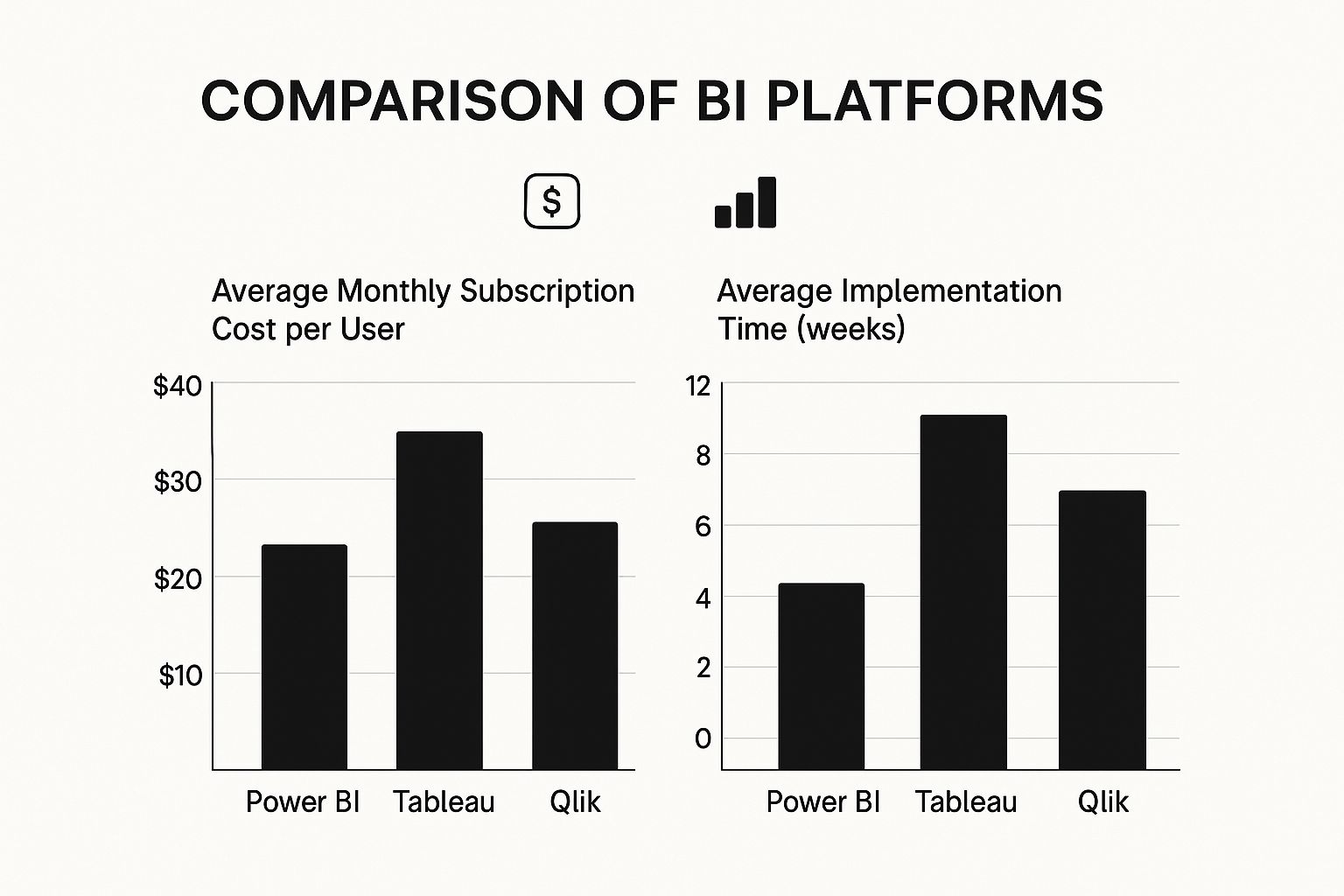
As you can see, Power BI often comes out ahead on cost-effectiveness and a faster rollout. Tableau and Qlik Sense typically represent a more significant investment, which reflects their deep, specialized capabilities.
Microsoft Power BI: The Ecosystem Integrator
Power BI shot to the top of the market for one huge reason: its seamless integration with the entire Microsoft ecosystem. If your business already runs on Office 365, Azure, or Dynamics 365, plugging in Power BI feels less like adopting a new tool and more like flipping a switch on analytics you already own.
The user interface is instantly familiar to anyone who’s spent time in Excel, which drastically cuts down on training time. This is a massive strategic advantage, as it encourages people across all departments to actually use the tool, rather than being scared off by a complex new platform.
Power BI's real magic isn't as a standalone product, but as the analytical glue holding the Microsoft suite together. It turns everyday apps like Teams and SharePoint into powerful, data-driven hubs.
This approach makes Power BI a fantastic choice for companies that want to get data into more hands without a huge training budget. It has a massive footprint in the market, holding over 30% market share as of 2021. For comparison, Tableau, another major player, had about 16.99% of the BI market that same year, with over 100,000 customers.
Tableau: The Visual Analytics Powerhouse
For years, Tableau has been the benchmark for brilliant data visualization and interactive analysis. The platform was built from the ground up to help people truly see and understand their data. Its drag-and-drop interface is incredibly intuitive, allowing just about anyone to create beautiful, insightful visuals without touching a line of code.
This intense focus on visual storytelling makes Tableau a go-to for marketing teams, researchers, and anyone who needs to communicate complex findings to a non-technical audience. It’s simply unmatched at turning a spreadsheet full of numbers into a clear, compelling story.
Here’s where Tableau really shines:
Unmatched Visualization Quality: It offers a huge library of charts, graphs, and maps with deep customization, letting you design dashboards that are both beautiful and incredibly informative.
Intuitive User Experience: The platform is built for exploration. Users can drill down, apply filters, and ask new questions on the fly without having to start over.
Strong Community Support: Tableau has a massive and passionate user community that’s always sharing templates, tips, and solutions. It's an incredible resource.
While it often comes with a higher price tag, organizations that value top-tier data visualization and user-led exploration find it's worth every penny. For a deeper look at how it stacks up, check out our business intelligence tools comparison which is best for your needs.
Qlik Sense: The Associative Engine for Data Discovery
Qlik Sense brings something totally different to the table with its powerful and unique Associative Engine. Traditional, query-based BI tools force you down a linear path of questioning. Qlik’s engine, however, lets you explore data from any direction.
When you click on a data point, the entire dashboard instantly reacts. It shows you not just the data you selected, but—crucially—all the data that is not associated with it. This "power of gray" is what makes Qlik so good at unearthing insights you weren't even looking for.
The Associative Engine is more than just a dashboarding tool. It's a genuine data exploration environment that rewards curiosity, helping you spot hidden patterns and outliers that linear tools would almost certainly miss.
This core capability, combined with its strong data governance and enterprise-level scalability, makes Qlik a top contender for large organizations with messy, complex data and a need for deep, unguided exploration.
Head-to-Head Feature Comparison
To really understand the differences, it helps to see these platforms side-by-side. The table below breaks down how they compare across several key areas.
BI Platform Feature Comparison
Feature | Microsoft Power BI | Tableau | Qlik Sense |
|---|---|---|---|
Ease of Use | High. Very familiar for Excel users. The interface is clean and straightforward for building standard reports. | Very High. The drag-and-drop UI is the industry gold standard for intuitive, user-friendly data exploration. | Moderate. The Associative Engine requires a new way of thinking, but it's incredibly powerful once you get the hang of it. |
Data Visualization | Good. Offers a solid range of visuals and a marketplace for custom additions. Functionally very strong. | Excellent. Best-in-class for visual quality, interactivity, and design flexibility. Built for data storytelling. | Good. Focuses on functional, highly interactive visuals, but with less emphasis on the aesthetic polish of Tableau. |
Data Connectivity | Excellent. Has native connectors for the entire Microsoft suite plus a massive library of third-party sources. | Very Good. Connects to a wide range of databases, cloud applications, and local files. | Very Good. Provides robust connectivity options, with a strong focus on enterprise systems and complex data sources. |
Pricing Model | Very Cost-Effective. A free desktop version and a low-cost Pro license make it extremely accessible. | Premium. Generally a higher per-user cost, with tiers based on roles like Creator, Explorer, and Viewer. | Premium. Subscription-based pricing that scales with users and data, often representing a significant investment. |
Governance | Strong. Taps into Azure's security and governance framework for robust, enterprise-level control. | Good. Offers solid security and permissions features, but can require more manual setup than Power BI. | Excellent. Built from the ground up for enterprise governance, with granular control over data access and security. |
Ultimately, there's no single winner here. The right choice comes down to balancing your budget, technical resources, current infrastructure, and what you're trying to achieve. Power BI is a clear leader on cost and Microsoft integration, Tableau is the champion of visual analytics, and Qlik excels at deep data discovery and enterprise governance.
Analyzing Real-World BI Software Use Cases

A theoretical business intelligence software comparison is one thing, but seeing how these platforms actually perform in the wild is where the rubber meets the road. Their true value comes to light when they’re put to work solving specific, high-stakes business problems.
From untangling retail supply chains to directly improving patient outcomes in healthcare, these tools are much more than just chart-makers. They're engines for operational excellence. Every industry faces its own unique data challenges, and the right BI platform can transform that complexity into a serious competitive edge. Let’s dive into some practical applications to see where these tools really shine.
By connecting specific platform features to real-world needs, it becomes clear why a tool like Tableau is a favorite for marketing's visual storytelling, while Power BI's sheer scalability makes it a go-to for manufacturing. These examples give you a concrete framework for figuring out which platform truly fits your business.
Optimizing Retail and Supply Chain Logistics
In the cutthroat world of retail, winning or losing comes down to understanding your customers and keeping your supply chain from breaking. BI software is the critical link that turns a flood of transaction and inventory data into strategies that actually work. Imagine a national retailer using a BI tool to analyze sales by region, right down to the specific store and hour.
This kind of granular view lets them spot buying trends the moment they start, keeping hot items on the shelves and preventing warehouses from filling up with products that aren't moving. We're not just talking about looking back at last month's numbers; this is about predictive inventory management that directly boosts the bottom line.
A key differentiator in retail BI is the ability to merge sales data with external factors like local events, weather patterns, or social media trends. This creates a holistic view that explains why sales are changing, not just that they are.
By visualizing all these interconnected data points, managers can make smarter calls on everything from a weekend marketing push in one city to re-routing national logistics. The payoff is a more agile supply chain, happier customers, and much healthier profit margins.
Enhancing Healthcare and Patient Outcomes
The healthcare industry is built on a mountain of critical data, from individual patient records to massive operational datasets. BI tools are essential for making sense of it all to improve both patient care and hospital efficiency. Providers rely on BI dashboards to keep a finger on the pulse of key performance indicators in real time.
For instance, a hospital network could dig into patient readmission rates. By slicing that data by diagnosis, attending physician, and patient demographics, administrators can uncover patterns pointing to preventable readmissions. Those insights can then drive direct changes to post-discharge care, leading to better patient health and significant cost savings.
This is all powered by core BI capabilities like data mining, predictive modeling, and dashboard reporting, which make complex trends and KPIs easy to grasp. While a retailer is using BI to watch sales, a hospital is using it to improve care—a great example of how versatile these platforms are. You can get a broader sense of how BI is applied across different sectors by exploring these market insights.
Driving Decisions in Finance and Manufacturing
In the financial sector, risk management and regulatory compliance are non-negotiable. BI software takes the pain out of creating complex compliance reports, drastically cutting down on human error and freeing up hundreds of hours. At the same time, financial analysts use live dashboards to monitor market shifts and portfolio performance, giving them the ability to react in an instant.
Over in manufacturing, BI platforms are plugged directly into the factory floor to watch over production line efficiency. By connecting to IoT sensors on machinery, these tools can predict when a piece of equipment needs maintenance before it breaks down, preventing expensive downtime. This is a perfect example of how predictive analytics in BI directly protects a company's assets and keeps operations running smoothly.
How to Choose the Right BI Software for Your Business

Okay, we've broken down the major players. Now comes the hard part: making a choice. The truth is, there's no single "best" BI platform. The right tool for you hinges entirely on your company's reality—your size, budget, technical skills, and what you're actually trying to achieve. The goal is to find a perfect match between a tool's capabilities and your business's needs.
Think of this section as your practical guide to making that final call. Instead of picking a single winner, I'll give you clear, situation-based recommendations. This way, you can weigh the trade-offs and choose a platform that not only works today but grows with you tomorrow.
For Startups and Small Businesses
If you're running a smaller operation, your priorities are almost always the same: keep costs down, get up and running fast, and make it easy for everyone to use. You need powerful insights, but you can't afford a dedicated data science team or a huge upfront investment to get them. It’s all about getting actionable data to your decision-makers without breaking the bank.
In this situation, Microsoft Power BI is often the smartest place to start. Its free desktop version makes it a no-brainer to try, and the low cost of its professional tier is hard to beat. Because it feels so much like Excel, your team can pick it up quickly, which means people will actually use it from day one.
The best BI tool for a small business is one that gets used. Prioritizing a simple user interface and minimal training requirements over complex, enterprise-grade features ensures the investment provides a fast return.
Another thing to look for is a clear upgrade path. The tool that fits you perfectly now should have room to grow as your data and ambitions expand, so you aren't forced into a painful migration down the road.
For Mid-Sized Companies with Diverse Systems
Mid-sized companies live in a tricky middle ground. Your tech stack is way more complicated than a startup's, but you don't have the massive IT department of a large enterprise. Your CRM, ERP, and marketing platforms probably all come from different vendors, creating data silos that are a real pain to connect.
For a business like this, robust integration capability is non-negotiable. You need a BI tool that can effortlessly pull data from a wide variety of cloud apps and on-premise databases. This is where a platform like Tableau really shines. It’s known for its huge library of connectors that can bring all your disconnected data sources together into one unified view.
You also need a good balance of scalability and governance. The platform has to handle more and more data while giving you the security controls to manage who sees what across different departments. When multiple teams depend on the same data, automation is your best friend. You can learn more by reading our https://www.flowgenius.ai/post/a-guide-to-business-process-automation to see how workflows can help maintain data integrity.
For Large Enterprises with Complex Data Needs
At the enterprise level, the game completely changes. You’re operating in a massive, intricate data ecosystem. The conversation shifts from simple dashboards to ironclad security, governance, and sheer performance at scale. The tool you choose must enforce strict data policies and handle complex queries from thousands of users at once without breaking a sweat.
This is the territory of heavy-hitters like Qlik Sense and the enterprise-level plans for Power BI and Tableau. Their key advantages are:
Advanced Governance: They provide fine-grained control over data access, user permissions, and tracking data lineage.
High-Performance Processing: These platforms are engineered to chew through queries on billions of rows of data from multiple enterprise systems.
Scalability: They are built from the ground up to support thousands of concurrent users across a global organization.
The decision here is less about a single feature and more about how the platform fits into your entire enterprise architecture. Can it integrate with your existing data warehouses and security protocols? At this scale, the total cost of ownership—including maintenance, support, and training—becomes a massive factor in the final decision.
Answering Common Questions About BI Software
Even after doing a side-by-side comparison of BI software, you're often left with practical questions. The final call goes beyond a feature list; it's about anticipating real-world challenges like implementation timelines and getting your team on board. This section tackles those common concerns head-on so you can move forward with clarity.
Let's be honest, picking the platform is just the first step. The real win comes from a smooth deployment and company-wide adoption. That’s what delivers the return on your investment. So, let's get into the questions that pop up during this critical stage.
How Long Does BI Implementation Take?
The timeline for getting a BI platform up and running can vary wildly, but it's almost never an instant flip of a switch. For a smaller project connecting to just a couple of clean data sources, you might be looking at 4 to 8 weeks. For a typical mid-sized business juggling multiple data systems, a more realistic window is 3 to 6 months.
For large enterprises, these rollouts can easily stretch past a year. The timeline really hinges on a few key things:
Data Readiness: This is the big one. How clean and organized is your source data? If it's a mess, you'll spend a lot of time on prep work before you can even think about building dashboards.
Integration Complexity: The number and type of data sources you need to connect will directly affect how long the setup takes.
Customization Needs: If you're building out specific, tailored reports and dashboards for different departments, that's going to add to the initial deployment phase.
How Can We Ensure High User Adoption?
There's no bigger waste of money than a powerful BI tool that sits on the shelf collecting dust. Getting people to actually use it is everything. It starts with picking a tool that fits your team's technical comfort level, but true success comes from building a culture that values data.
The goal isn't just to provide access to data; it's to make engaging with data a natural part of everyone's daily workflow. This requires a strategic focus on training, accessibility, and demonstrating early wins.
A great place to start is with our guide on how to turn data into actionable insights a practical guide, which lays out strategies for fostering this kind of environment. A pro tip? Launch with just a few high-impact, easy-to-read dashboards. This shows the tool's value right away and helps build momentum.
Is Migrating Between BI Tools Difficult?
In a word, yes. Moving from one BI platform to another is a major project, not a simple copy-and-paste job. The problem is that every single dashboard, report, and data model you've built is tied to the unique architecture of your current tool.
This means a migration usually involves rebuilding everything from scratch in the new system. It's a time-consuming and expensive process, which really underscores how important it is to choose a flexible and scalable platform from day one. Making a smart choice now can save you from a painful migration down the road.
Ready to streamline your operations and make data work for you? At Flow Genius, we specialize in designing and implementing smart automation solutions that eliminate manual tasks and unlock your business's full potential. Schedule a consultation today and discover how we can build a more efficient future for your company.

Comments