Turn Data into Actionable Insights: A Practical Guide
- Jun 30, 2025
- 13 min read
To truly turn data into actionable insights, you have to stop just hoarding numbers and start asking what they actually mean for your business. It's a methodical journey, one that starts with clear goals and moves through cleaning, analyzing, and finally, translating what you find into specific actions that create real-world results.
Why Turning Data Into Insights Is Critical for Growth

In a world drowning in raw information, the real competitive edge comes from being able to turn that noise into clear business intelligence. Let's be honest: a data-driven culture isn't a "nice-to-have" anymore. It’s a core requirement for survival and growth. This isn't just about pretty charts; it's about building a solid foundation for making smarter, faster, and more confident decisions across your entire organization.
The tangible outcomes are what really matter here. The best companies I've seen use insights to build incredibly personalized customer experiences, find and fix operational bottlenecks, and even discover entirely new ways to make money.
Think about it this way: analyzing customer behavior might show you that a huge percentage of users abandon their carts right at the payment step. That's not just a data point. That's a powerful insight telling you to fix a broken, likely frustrating, checkout process.
The Soaring Demand for Data Analytics
This strategic shift isn't just a trend; it's a seismic change reflected in massive market growth. The global data analytics market, already valued at around USD 74.26 billion, is expected to grow at an explosive annual rate of 23.12%. Projections show it could hit a staggering USD 482.61 billion by 2033. This isn't just a number—it’s a clear signal of the urgency businesses feel to make sense of their data.
This guide is designed to walk you through that entire journey, from wrestling with messy, raw data to delivering tangible business impact. I’ll show you how to start asking the right questions that unlock those game-changing discoveries.
The real goal is to bridge the gap between what the data says and what the business should do. An insight is completely useless until it inspires a clear, confident action.
The Data-to-Insight Journey at a Glance
To give you a high-level overview, here's a quick look at the core stages we'll be exploring. Think of this as your roadmap for the entire process.
Stage | Primary Goal | Key Activities |
|---|---|---|
Foundation | Build a reliable, clean data source. | Data collection, cleansing, and preparation. |
Discovery | Find the hidden stories in the data. | Analysis, pattern recognition, and trend identification. |
Storytelling | Communicate findings effectively. | Data visualization and narrative creation. |
Action | Drive measurable business outcomes. | Translating insights into strategic actions. |
Each part of this guide builds on the last, giving you a complete framework to work with.
What This Guide Covers
We’ll dive deep into the entire process, breaking it down into manageable, actionable stages. For those who want even more depth, this complete playbook for turning data into actionable insights offers another fantastic perspective.
Here’s what our journey will cover:
Building a Reliable Data Foundation: We'll start with the essentials—how to collect, clean, and prepare your data so you can trust the results.
Uncovering Stories in Your Data: This is where the magic happens. I'll share techniques for finding those hidden patterns and trends.
Visualizing Your Findings: Learn to create compelling narratives with your data that anyone in the business can understand and get behind.
Driving Business Impact: Finally, we’ll focus on the most important part: turning your hard-won insights into concrete actions and measurable results.
Building a Reliable Data Foundation
Every powerful, game-changing insight starts with a simple, unglamorous truth: your analysis is only as good as the data you feed it. If you want to genuinely turn data into actionable insights, you have to first build a solid foundation. This is about more than just grabbing data; it's about being obsessed with its quality, relevance, and structure.
Think of it like building a house. You wouldn't put up walls on a shaky, cracked foundation, right? Yet, I see businesses all the time trying to make critical decisions based on messy, unreliable data. The first step is to be ruthlessly selective about what you collect.
Identifying and Collecting the Right Data
Before you pull a single data point, you need to know exactly what business questions you're trying to answer. Don't just vacuum up data from your CRM, web analytics, and social media because you can. Instead, ask yourself what specific information will actually help you understand customer behavior, operational snags, or emerging market trends.
Let's take a real-world example. A retail company worried about customer churn shouldn't just stare at high-level sales figures. They need to dig deeper and collect data on things like:
Purchase frequency: How often are customers really coming back?
Customer support tickets: What are the recurring complaints or frustrations?
Website behavior: Are at-risk customers lingering on the returns policy page before they disappear?
This focused approach means every piece of data you gather has a clear purpose. It keeps you from drowning in an ocean of irrelevant information.
The Critical Role of Data Cleaning
Once you have your data, I can guarantee it will be messy. You’ll find missing values, inconsistent formats (like "USA" vs. "United States"), and plenty of good old-fashioned human error. This is where data cleaning, or data hygiene, is absolutely non-negotiable.
There's a well-known rule of thumb in my field: data scientists often spend up to 80% of their time just cleaning and preparing data. This isn't wasted effort—it's the single most important investment you can make in the entire process.
Skipping this step will inevitably lead to flawed analysis and bad decisions. It’s the bedrock of trustworthy insights. If you want to dive into the specific "how-to," we have a guide on the 7 essential data cleaning techniques for 2025 that I highly recommend.
The flow from raw, messy data to a clean, final insight is a journey, as this chart shows.
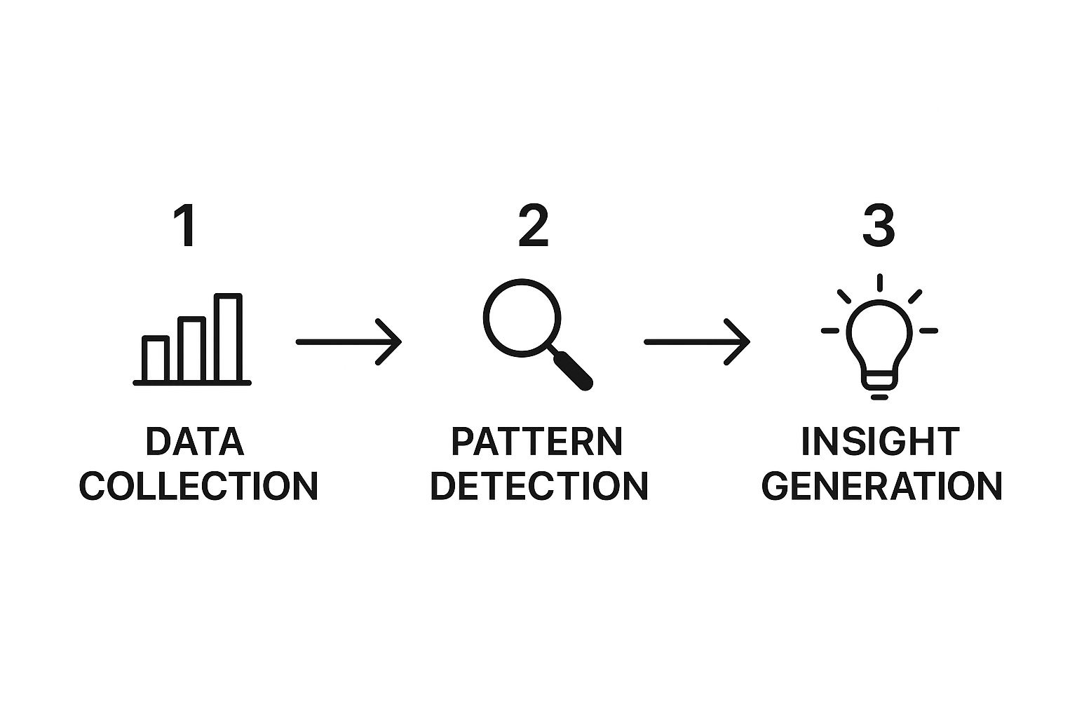
As you can see, generating real value is a sequential process. The quality of each step is completely dependent on how well the previous one was executed.
Unifying Data From Different Silos
One of the biggest hurdles most businesses face is that their data lives in separate, disconnected systems. Customer information is in a CRM, sales figures are in an accounting platform, and marketing campaign data is in yet another tool. To get the full picture, you have to bring it all together.
Now, this isn't always easy. Integrating data from these diverse sources often requires dedicated platforms to pull everything together seamlessly. That’s why major players like Alteryx, Microsoft, and Oracle are investing so heavily in this space. The market for data analytics is booming precisely because this integration is so vital.
Just imagine what you could do by combining social media sentiment data with themes from your customer support tickets. You could move beyond just seeing that a customer is unhappy to truly understanding why—and then fix the root cause before more customers are affected. This unified foundation is where true, actionable intelligence is born.
Uncovering Stories in Your Data

Once your data is clean and organized, the real fun begins. This is the part where you stop just looking at numbers and start asking what stories they’re trying to tell you. It’s all about finding those hidden patterns, trends, and correlations that spark genuine "aha!" moments.
Your first move is to look backward. This is what we call descriptive analytics, and its job is to answer one simple question: "What happened?" Think of it as summarizing past events—calculating last quarter's sales figures or pinpointing your top-selling product. It sets the baseline and gives you a clear snapshot of your business performance.
But a real insight doesn't just stop there. You have to ask the most important follow-up question: "Why did it happen?"
From What to Why with Analytics
Figuring out the "why" is the heart of diagnostic analytics. It’s about digging into the context behind the raw numbers. For example, if descriptive analytics reveals a 20% drop in website traffic, diagnostic analytics is what helps you uncover the cause. Was it a broken link in a marketing email? A competitor's new campaign? A sudden change in Google's algorithm?
To get these answers, you need to pick the right tool for the job. Here are a couple of powerful techniques I’ve seen work wonders:
Regression Analysis: This is fantastic for figuring out which variables actually move the needle. You could use it to see which of your marketing efforts—email, social media, content—are truly driving revenue, rather than just clicks or impressions.
Cluster Analysis: This technique is perfect for segmenting your audience in ways you hadn't thought of. You might uncover an entirely new customer persona based on how they shop and navigate your site, which opens the door for hyper-targeted marketing.
A really effective way to piece these stories together is through digital customer journey mapping for business growth. It helps you connect the dots across different touchpoints to see the full picture of your user’s experience.
The goal isn't to run every analysis under the sun. It’s to ask smarter questions and let those questions guide your technical approach. The most valuable insights often come from a simple question that no one thought to ask before.
Looking Ahead with Predictive Power
After you get a solid grasp of the past, you can start forecasting the future. This is the world of predictive analytics, which uses historical data to project what’s likely to happen next. This is a critical step to turn data into actionable insights because it lets you get ahead of the curve instead of constantly reacting to it.
This field is exploding thanks to AI, machine learning, and accessible cloud analytics platforms. Companies now rely on this kind of data for everything from real-time operational decisions to shoring up their supply chains.
Of course, none of these analytical methods work in a vacuum. They all depend on bringing information together from different places. To make that happen, you have to first master the data integration process for better insights. By blending different analytical techniques on a unified dataset, you can build a complete story—from what happened yesterday to what you need to prepare for tomorrow.
Turning Numbers into Stories Through Data Visualization
Let’s be honest: a brilliant insight is useless if no one understands it. This is where data visualization comes in. It’s less about making pretty charts and more about translating your hard-won analysis into a clear, persuasive story. A great visual makes the "so what?" of your findings impossible to ignore and guides your audience straight to the right conclusion.
Your real goal here is to bridge the gap between complex analysis and concrete action. You aren't just presenting numbers on a slide; you're building a narrative that makes the key takeaways obvious to everyone in the room, from the CEO down to the new marketing intern. A well-crafted visual can illuminate the path forward so clearly that the next business decision feels almost inevitable.
Pick the Right Chart for the Job
The type of visual you choose has a massive impact on how your message lands. Just dumping your data into a program's default chart style is a recipe for confusion. You have to be deliberate and select the visual that best tells the specific story you want to communicate.
Start by asking yourself: what am I trying to show?
Comparing different groups? A bar chart is your go-to. Nothing beats it for showing how different segments, like marketing channels or product categories, stack up against each other.
Showing a trend over time? Use a line chart. It’s the clearest way to illustrate progress, like tracking website traffic over a quarter or sales growth year-over-year.
Pinpointing areas of high activity? A heat map is perfect. It’s fantastic for showing concentration, like which parts of your website homepage get the most clicks.
Matching the chart to your communication goal is the foundational step. Get this right, and you're halfway there.
An effective dashboard doesn't just report on metrics; it tells a story. It should give people the clarity to make fast, informed decisions that push the business forward.
Build Dashboards That Actually Get Used
Static charts in a presentation are fine, but interactive dashboards are where the real magic happens. With tools like Tableau or Microsoft Power BI, you can create dynamic environments where your colleagues can explore the data for themselves. They can filter, sort, and drill down into the numbers that matter most to their roles. This kind of self-service analytics builds a stronger, more data-literate culture.
Think about a product performance dashboard. It could help the team monitor inventory in real-time, instantly spot the best-selling items, and even dig into the reasons for product returns. These aren't just passive metrics; they are direct calls to action. The insights lead to tangible results, like adjusting stock levels before a shortage or rewriting product descriptions to bring down the return rate.
When you're building a dashboard, keep a few core design principles in mind. They’ll make your findings pop and prevent people from drawing the wrong conclusions:
One visual, one idea. Don't try to cram too much into a single chart. If you have three things to say, make three charts. Simplicity is clarity.
Label everything clearly. Axes, titles, and legends should be so descriptive that anyone can understand the chart without needing you to explain it.
Guide their eyes. Use color, bold text, or simple callouts to draw attention to the most critical data points. Tell them where to look.
By following these simple rules, you can transform a complex dataset into a clear, compelling story that inspires your team to turn data into actionable insights.
Turning Insights Into Business Impact

Here's where all your hard work pays off. After wading through all that data—cleaning it, analyzing it, and making it look good in a dashboard—you're left with a powerful insight. But let's be honest, an insight collecting dust in a report is just trivia. It only becomes valuable when it sparks a real business decision and creates a measurable impact.
The real aim is to weave this process into the very fabric of your company, making smart, informed choices the norm, not the exception. This requires moving beyond just presenting interesting findings and toward creating a clear path to action. Ultimately, this is what enables genuine data-driven decision making across your entire organization.
Tailor Your Message for Your Audience
I've learned this the hard way: not everyone needs or wants to know the gory details of your analysis. In fact, overwhelming your stakeholders is one of the quickest ways to see their eyes glaze over and kill any momentum you've built. To turn data into actionable insights, you have to speak their language.
For Leadership: They're focused on the big picture. Give them a high-level executive summary that zeroes in on the bottom line. Talk about potential revenue, cost savings, or strategic market advantages.
For Operational Teams: They're the ones in the trenches who need to know how. Provide a detailed, evidence-based action plan with clear recommendations they can run with immediately.
Think about it this way. Say you discover that customers who use your app's search feature are 3x more likely to make a repeat purchase. For the C-suite, you'd highlight the potential $2 million annual revenue lift from boosting adoption of that feature. But for the product team, you'd deliver a plan detailing the specific UI tweaks and in-app prompts needed to get more users tapping that search bar.
From Recommendation to Roadmap
An insight without a concrete plan is just a cool observation. Once you’ve laid out your recommendations, the very next step is to build a practical roadmap for implementation. This isn’t about creating some massive, overly complex project plan. It's about defining the immediate, tangible steps to bring your insight to life.
A solid roadmap simply answers a few critical questions:
What's the action? (e.g., "Launch a retargeting campaign for shoppers who abandoned their carts.")
Who owns it? (e.g., "The digital marketing team.")
When will it be done? (e.g., "Campaign goes live within two weeks.")
How do we know it worked? (e.g., "We'll track for a 15% drop in cart abandonment within 30 days.")
An insight's journey doesn't end with a presentation. It ends when a change is made and the results are measured. That feedback loop is what separates one-off wins from a culture of continuous improvement.
Validate and Measure Everything
So, how do you prove your insight-driven change actually made a difference? You test and measure it. A/B testing is your best friend here, allowing you to validate your ideas in the real world without betting the farm. For instance, before pushing a redesigned checkout process to all users, test it against the old version with a small, controlled segment.
This creates a powerful feedback loop. The results from your test become fresh data, feeding right back into the start of the cycle. Did the change deliver the expected outcome? If yes, fantastic—scale it up. If not, you now have new data to dig into to understand why and refine your strategy.
This cycle of insight, action, and measurement is how you build a truly data-fluent organization. Measuring the outcome is also non-negotiable for proving your worth; understanding your automation ROI is your guide to maximizing real returns and showing that your data initiatives are delivering real, tangible value.
Answering Your Top Questions About Using Data
Even with a solid plan, stepping into the world of data can feel a bit daunting. I've worked with countless professionals as they make this transition, and I've noticed the same questions and roadblocks pop up time and again. Let's tackle some of the most common ones right now.
Getting these cleared up early will save you a world of headaches down the road.
What are the biggest mistakes people make?
Without a doubt, the number one mistake I see is diving into the data without a clear business question. People get excited about the potential and just start digging, hoping for a "eureka!" moment. This almost always leads to analysis paralysis—you're just swimming in numbers with no direction.
The other classic blunder is skimping on data quality. It's not the glamorous part of the job, but it's the most important. I've seen entire strategies built on faulty, incomplete data, and the results are often worse than if they'd just trusted their gut. Bad data doesn't just give you bad insights; it gives you dangerously confident bad insights.
A subtle but powerful trap is confirmation bias. We all have a natural urge to find data that proves what we already think is true. You have to actively fight this. Be skeptical of your own assumptions and let the data guide you, even if it leads somewhere unexpected.
So, my advice is simple: always start with a "why," dedicate serious time to cleaning your data, and stay curious.
What tools should a beginner focus on?
You don't need a complex, expensive software suite to get started. Honestly, a powerful spreadsheet program like Microsoft Excel or Google Sheets is the perfect place to begin. They are fantastic for getting your data organized, running initial analyses with features like pivot tables, and creating simple charts to spot early trends.
Once you feel you're hitting the limits of a spreadsheet, it's time to look at a dedicated Business Intelligence (BI) tool.
For powerful visuals without code: A platform like Tableau or Microsoft Power BI is the logical next step. Their drag-and-drop interfaces let you build incredible, interactive dashboards that really bring your data to life.
For deeper, custom analysis: If you want to get your hands dirty with code, Python is the undisputed king. With libraries like Pandas for manipulating data and Matplotlib for creating custom plots, you can do just about anything.
Start with spreadsheets. Get comfortable. Then expand your toolkit as your needs and skills grow.
How do I get my boss and other stakeholders on board?
This is all about translation. You have to stop talking about data models and start talking about business impact. Your leadership team cares about outcomes, so frame your pitch in their language.
Build a business case that connects your work directly to the things they lie awake at night thinking about:
Growing Revenue: "If we analyze customer purchase patterns, I believe we can identify a new cross-selling opportunity worth $X."
Cutting Costs: "By analyzing our logistics data, we can pinpoint inefficiencies that are costing us an estimated $Y per quarter."
Keeping Customers Happy: "This customer feedback data shows us exactly why people are churning. Fixing this could improve retention by Z%."
The single most effective way to get buy-in? A small, successful pilot project. Find a manageable but visible problem, use data to solve it, and present the clear, measurable win. That proof of concept is your golden ticket to getting support for bigger, more ambitious projects.
Ready to stop guessing and start making data-driven decisions? The team at Flow Genius specializes in building the automated systems that collect, clean, and analyze your data, transforming it into clear, actionable insights. Book a discovery call today to see how we can build a custom data strategy for your business.