top of page

Insights

Short. Precise. Effective.

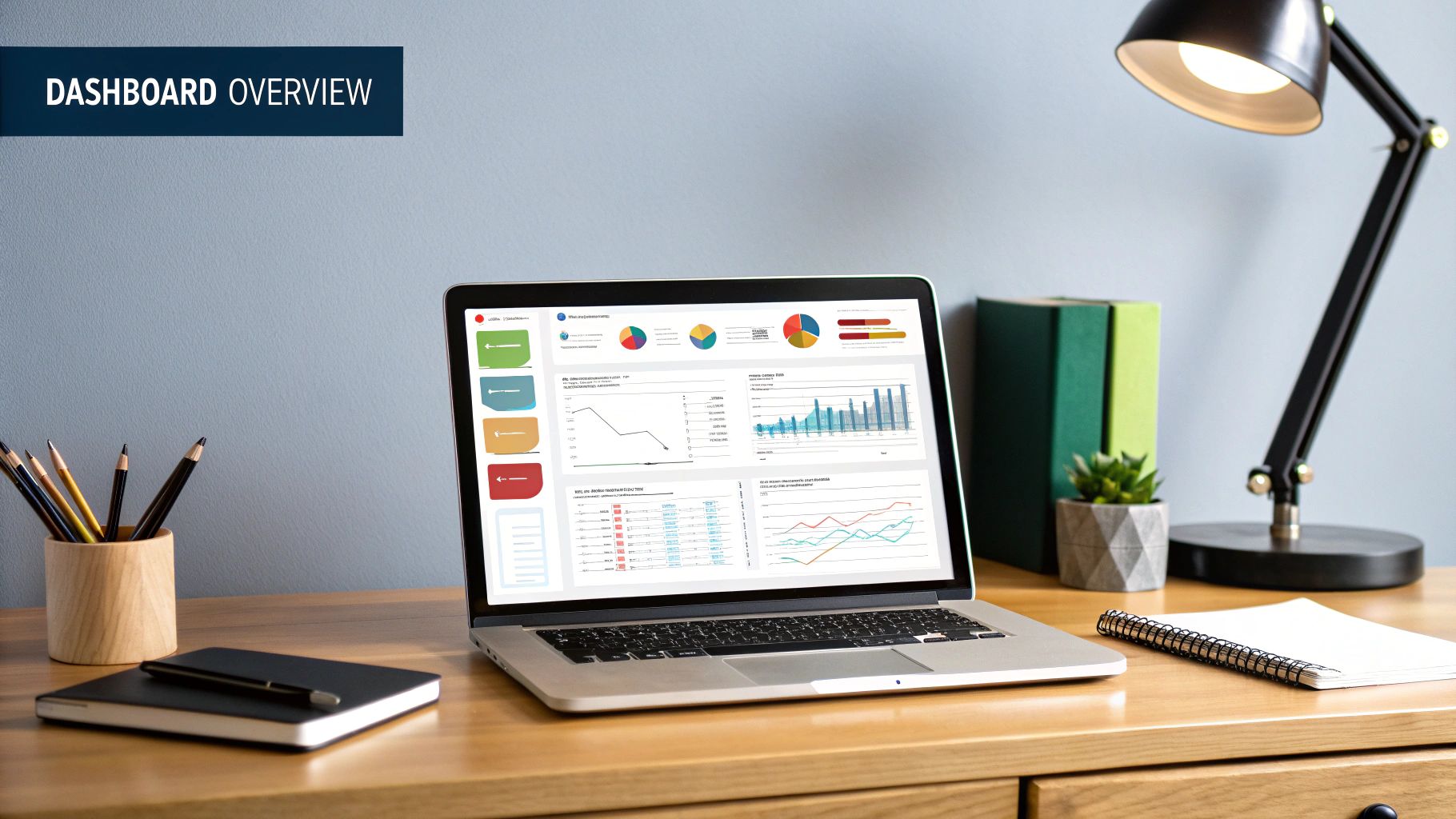
Think of a business intelligence (BI) dashboard as your company's digital cockpit. It’s a powerful visualization tool that pulls in all your key metrics and performance indicators (KPIs) from different parts of the business and displays them on a single, easy-to-read screen. This gives you a live, at-a-glance view of exactly how things are going.


Your Business Data's Command Center


Imagine trying to fly a plane where all the critical dials—speed, altitude, fuel—were scattered randomly throughout the cabin. It would be a nightmare. A modern cockpit, on the other hand, organizes everything you need to know onto a few clear screens. That's precisely what a good BI dashboard does for your company.


Instead of drowning in endless spreadsheets or static, outdated reports, you get a live, interactive command center. It acts as a central hub, connecting to all your vital data sources and presenting that information visually, making it easy to spot trends, flag potential problems, and make sharp, informed decisions on the fly.


From Raw Data To Actionable Insight


At its heart, a BI dashboard is a master of transformation. It takes in raw, often chaotic data from all your different business systems—sales, marketing, finance, operations—and turns it into something meaningful.


This process is critical for creating what we call a “single source of truth.” When everyone from the C-suite to the front lines is looking at the same numbers, collaboration skyrockets, and everyone gets aligned on the same strategic goals.


To put it simply, a BI dashboard is built to perform several key jobs.


Core Functions of a Business Intelligence Dashboard


This table gives a quick summary of the primary roles a BI dashboard plays in an organization.


Function

Description

Data Consolidation

Gathers data from multiple, often disconnected, sources (like CRM, ERP, and databases) into one centralized view.

Data Visualization

Transforms raw numbers and complex datasets into intuitive visuals like charts, graphs, and maps.

Real-Time Monitoring

Provides live updates on key performance indicators (KPIs), allowing for proactive rather than reactive management.

Interactive Exploration

Enables users to filter, drill down, and segment data to uncover deeper insights and answer specific business questions.


Ultimately, these functions work together to turn messy data into a clear story.


A business intelligence dashboard isn't just a collection of charts; it's a dynamic storytelling tool that reveals the narrative hidden within your data, guiding you toward better business outcomes.

The Power Of Interactivity


What really sets a modern BI dashboard apart from a static report is its interactivity. You aren't just a passive viewer; you're an active explorer of your own data.


Features like filters and drill-downs let you slice and dice the information to answer specific questions in real-time. You might start with a high-level view of national sales, then drill down to see performance by state, then by city, and finally by individual salesperson—all in just a few clicks.


This hands-on exploration is how you uncover the why behind the numbers. This capability can be taken even further by leveraging AI and automation for enhanced business insights. When people can interact directly with data, it sparks curiosity and helps build a data-savvy culture across the entire organization.


Deconstructing an Effective BI Dashboard


To really get what a business intelligence dashboard is, you have to look under the hood. The best dashboards aren't just static pictures; they're more like the cockpit of an airplane. Every dial, gauge, and screen has a purpose, and they all work together to turn raw data into the insights you need to navigate your business. When all the pieces fit together just right, you get a powerful tool for exploration and decision-making.


The Foundation: Data Connectors


At the very core, you have data connectors. Think of these as the fuel lines. They are constantly pulling information from all the different systems your business runs on—your CRM, your accounting software, your website analytics—and feeding it directly into your dashboard. Without these connections, your dashboard is just an empty shell.


These connectors tap into a huge range of sources to give you a complete picture of what's going on.


  • Customer Relationship Management (CRM) systems like Salesforce to track your sales pipeline and every customer touchpoint.

  • Web Analytics Platforms like Google Analytics to see who's visiting your site and what they're doing.

  • Financial Software like QuickBooks or a full-blown ERP system to monitor revenue, costs, and profitability.

  • Marketing Automation Tools like HubSpot to see how your campaigns are performing.


This infographic breaks down how these components come together to create a truly powerful BI dashboard.


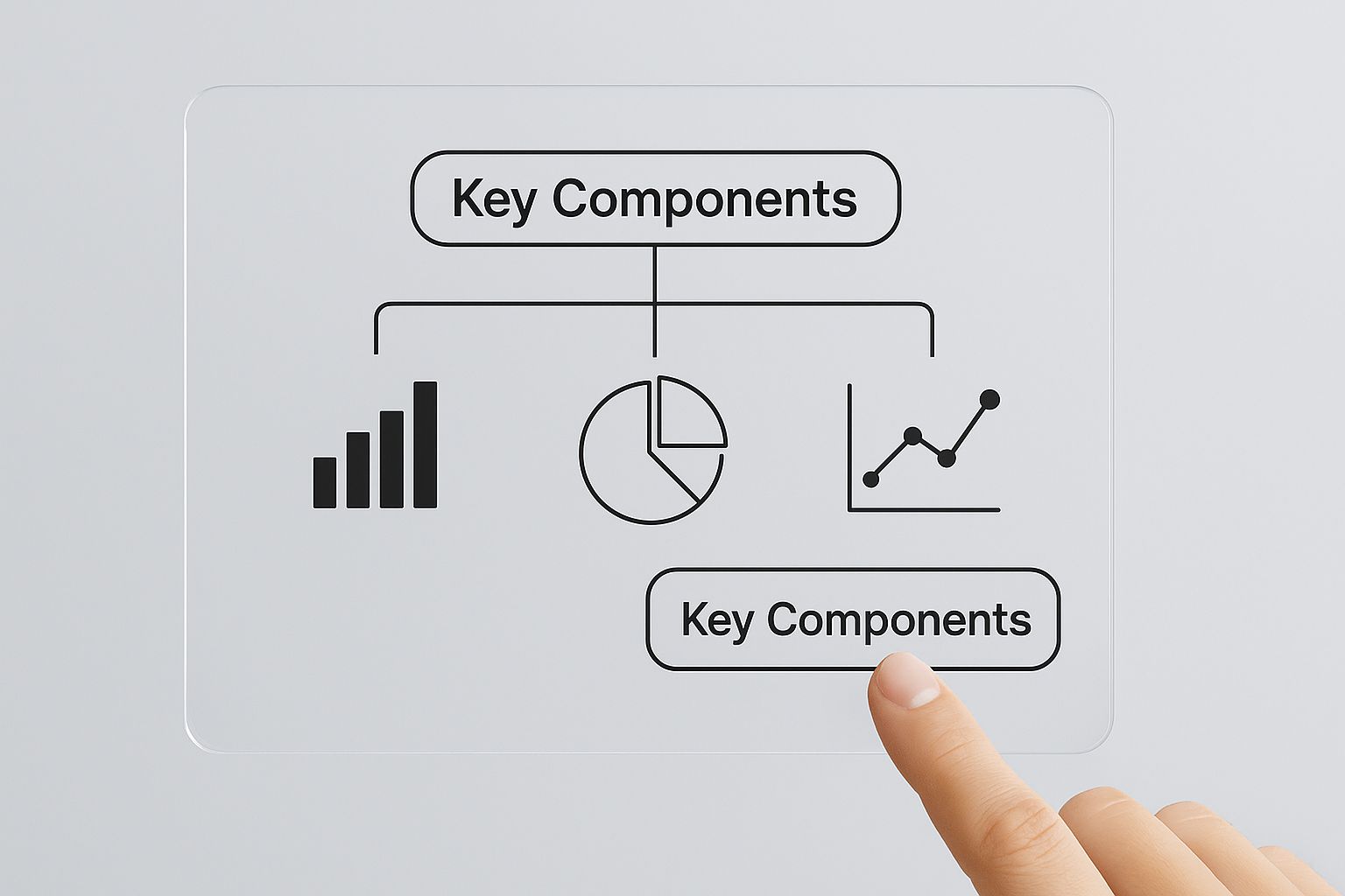
As the visual shows, it’s a journey from foundational data sources, through visualization and interaction, all the way to clear, actionable intelligence.


Translating Numbers into Narratives


Once the data is flowing in, the dashboard's job is to make sense of it all. This is where Key Performance Indicators (KPIs) and metrics come in. These are the specific, measurable numbers that tell you if you're hitting your most important business goals. They're the critical gauges on your control panel.


A KPI isn't just any old number; it's a number that truly matters. For a sales team, a crucial KPI might be monthly recurring revenue (MRR). For a customer support team, it could be the customer churn rate. Picking the right metrics gives you an instant read on the health of your business, letting you know if you're on course or if you need to make a correction.


An effective BI dashboard doesn't just show you data; it tells you a story. Each KPI is a character, each trend is a plot point, and the interactive features let you choose your own adventure, digging deeper into the narrative to find out why things are happening.

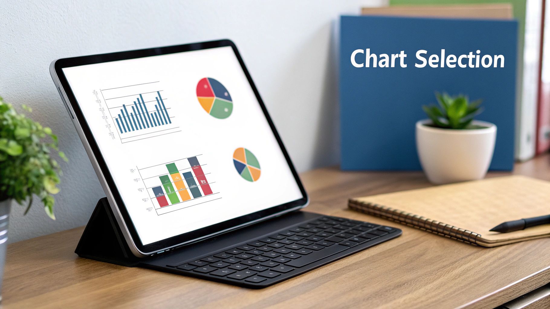
With your KPIs defined, the next step is to bring them to life with data visualizations. This is probably the part of a dashboard you're most familiar with. Staring at a spreadsheet of raw numbers is confusing, but a well-designed chart can make a trend obvious in seconds. Visualizations are what turn abstract data into clear, compelling stories.


You’ll see all kinds of visualizations used:


  • Line charts are perfect for tracking performance over time.

  • Bar graphs make it easy to compare different categories.

  • Pie charts show you the proportions of a whole.

  • Heat maps are great for visualizing the density of data points.

  • Geographical maps display any data that has a location component.


The Magic of Interactive Exploration


Here's where modern BI dashboards really shine: interactivity. This is the one thing that truly separates a dashboard from a flat, boring report. With interactive filters and drill-down features, you’re in the driver's seat, able to slice, dice, and explore the data from any angle you can think of.


Imagine a marketing manager looking at a high-level overview of website traffic. With a single click, they can filter that view to see only the traffic from a specific social media campaign. Another click, and they can drill down even further to see which ads in that campaign drove the most engagement. This ability to go from a 10,000-foot view right down to the nitty-gritty details is what makes a dashboard an actual analysis tool.


All these pieces—the data connectors, KPIs, visualizations, and interactive controls—work together seamlessly. They create a dynamic space where anyone, tech-savvy or not, can ask questions of their data and find the answers themselves. This empowers every person on your team to become more data-literate and make smarter decisions that move the business forward.


How BI Dashboards Drive Real Business Growth


Bringing a business intelligence dashboard into your company isn't just a tech upgrade. It’s a fundamental change in how your team operates and makes crucial decisions. This is the moment you stop relying on gut feelings and start making choices backed by solid data.


Forget waiting around for static monthly reports that are often obsolete by the time you see them. Instead, your teams get access to real-time insights, allowing for faster, smarter, and more agile decision-making across the board.


For example, imagine a marketing team notices a key ad campaign is tanking. With a live dashboard, they can spot that trend in hours, not weeks. They can immediately pivot, reallocating the budget to channels that are actually working, saving thousands and maximizing their ROI.


Unifying the Organization With a Single Source of Truth


One of the biggest wins from using a BI dashboard is that it shatters departmental silos. Traditionally, the sales team has their data, finance has theirs, and marketing works with completely different numbers. This disconnect almost always leads to conflicting priorities and a disjointed strategy.


BI dashboards fix this by creating a single source of truth. By pulling information from all your different systems into one centralized, visual hub, everyone—from the C-suite to the front-line staff—is looking at the same picture.


This shared view aligns the entire organization around common goals. When your sales and marketing teams can see exactly how campaigns are affecting the sales pipeline, their collaboration suddenly becomes a lot more strategic and effective.


From Reactive Fixes to Proactive Strategies


Without real-time data, businesses are often stuck putting out fires, fixing problems only after the damage is done. A well-designed BI dashboard completely flips that script, empowering proactive management and strategic foresight.


Think about an operations manager at a manufacturing plant. A dashboard tracking production line efficiency can instantly flag a bottleneck as it starts to form. This alert lets the manager address the issue before it causes a major shutdown, protecting delivery timelines and preventing expensive disruptions. This is a perfect example of how data-driven automation can power operational excellence. You can learn more in our guide to the [unmissable benefits of business automation](https://www.flowgenius.ai/post/8-unmissable-benefits-of-business-automation-in-2025).


A business intelligence dashboard acts as an early warning system. It doesn't just tell you what happened yesterday; it gives you the insights needed to shape what happens tomorrow, turning potential crises into manageable adjustments.

This shift toward proactive decision-making is fueling incredible industry growth. The global BI dashboard market was valued at around USD 4.8 billion and is expected to hit nearly USD 12.4 billion by 2033, growing at a compound annual growth rate of 11.2%. This boom is driven by the undeniable need for companies to make smarter, faster decisions to stay in the game. You can dive deeper into these trends in the [full report on the BI dashboard market](https://www.verifiedmarketreports.com/product/business-intelligence-dashboard-market/).


Gaining a Sustainable Competitive Advantage


At the end of the day, the ability to see and act on data faster than your competitors gives you a massive strategic edge. Companies that master their BI dashboards are far better at spotting new market trends, understanding what their customers really want, and identifying new ways to grow revenue.


By capitalizing on these insights long before their rivals even notice them, businesses can secure their position as market leaders and build a more resilient operation. This isn't just about being more efficient; it's about weaving data into the very fabric of your company culture. A BI dashboard turns data from a simple asset into your most powerful strategic weapon.


BI Dashboards in the Real World


Theory is one thing, but seeing a business intelligence dashboard in action is where you really grasp its power. These aren't just fancy tools for data scientists; they are practical, everyday instruments that leaders in every industry rely on to make critical calls.


Imagine a sales director starting their day. Instead of slogging through CRM exports and messy spreadsheets, they glance at a single screen. In an instant, they see the team’s progress toward quota, the pipeline's health broken down by stage, and a map showing which regions are on fire. This isn't just data—it's a battle plan, showing them exactly which reps need a hand and where to focus to land the biggest deals.


Empowering Decisions Across Industries


The beauty of a BI dashboard is its flexibility. It adapts to the specific challenges and goals of any business function, telling a story that its audience immediately understands. It turns a sea of raw numbers into a clear narrative that sparks action.


Here’s how a few different departments put them to work:


  • Retail and E-commerce: An e-commerce manager keeps a close eye on a live dashboard displaying website traffic, conversion rates, and cart abandonment. A sudden drop in conversions after a website update? They can ping the dev team right away to fix the issue, saving a ton of revenue.

  • Manufacturing and Operations: A factory’s operations manager uses a dashboard to monitor production line efficiency, track the supply chain, and get quality control alerts. This real-time view helps them spot a potential equipment failure before it shuts everything down, saving thousands in downtime.

  • Marketing Campaigns: A digital marketing team has a dashboard visualizing ad spend, click-through rates, and cost per acquisition across all their platforms. In a flash, they can see which ads are duds and shift their budget to the winners, making their campaigns smarter on the fly.


In every case, the dashboard provides the clarity needed to solve problems and jump on opportunities—fast.


A Look at Financial Dashboards


Finance departments were early adopters of BI dashboards, and for good reason. They need a crystal-clear view of the company's financial health, tracking everything from cash flow and profitability to budgets and expenses.


A well-built finance dashboard often includes:


  • Profit and Loss (P&L) Trends: A chart showing revenue, costs, and net income over time makes it easy to spot financial patterns.

  • Accounts Receivable Aging: This visualization shows who owes the company money and for how long, flagging potential cash flow hiccups before they become crises.

  • Budget vs. Actual Spending: A simple comparison that tells department heads if they’re on track with their budgets, no complex spreadsheets needed.


These visuals make dense financial data easy for non-finance folks to digest, which helps create a culture of accountability across the whole company. To see what these look like in practice, check out these real-world financial dashboard examples that show how businesses track their most important numbers.


Think of a BI dashboard as a universal translator. It takes the complex language of data and speaks to each department in terms they understand and can act on, from sales quotas to production metrics.

Driving Strategic Conversations


Beyond the daily grind, BI dashboards are essential for shaping long-term strategy. When the leadership team gets together for a quarterly review, they can pull up dashboards to see how performance stacks up against goals, analyze market trends, and make decisions about the company's future that are actually backed by data.


Instead of arguing over opinions, everyone is looking at the same reality. A dashboard might reveal a product line's declining profitability, kicking off a focused discussion about whether to reinvest or pivot those resources.


This is what separates the leaders from the laggards. Grounding your strategy in hard data moves you from constantly reacting to proactively shaping your market. By giving everyone access to insights, BI dashboards empower the whole team to contribute to growth, creating a culture where data is everyone’s most valuable asset.


Choosing the Right BI Dashboard Software


Picking the right business intelligence dashboard software can feel overwhelming. There are dozens of options out there, and it's easy to get lost in feature lists and fancy demos. The secret is to start with your needs, not the tool's capabilities.


Before you even start looking at software, get your team in a room and ask some tough questions. What problems are we actually trying to solve? Who needs this data, and are they a data analyst or a sales manager? Getting clear on these answers first will give you a filter to see which tools are contenders and which are just noise.


Self-Service Tools Versus Enterprise Platforms


One of the first big decisions you'll face is choosing between two main types of BI software. On one hand, you have self-service BI tools like Tableau or Microsoft Power BI. These are built for the everyday business user—think marketing, sales, or operations—who needs to get answers from data without writing a line of code. They often have intuitive drag-and-drop interfaces that make building a report feel simple.


On the other hand are the big, powerful enterprise BI platforms. These are the heavy-duty systems designed for large organizations with complex security needs and strict data governance rules. They’re built for scale and control, but that power often comes with a steeper learning curve.


The right choice isn't about which tool is "better" in a vacuum; it's about which tool best aligns with your company's culture, technical resources, and strategic objectives. A perfect tool for a startup could be a poor fit for a global corporation, and vice versa.

The demand for these tools is exploding for a reason. The business intelligence market was valued at USD 41.74 billion and is expected to climb to an incredible USD 151.26 billion by 2034. That's not just hype; it shows that making smart, data-backed decisions is no longer a luxury—it's essential for survival. You can explore more about this expanding market on Precedence Research.


Comparing BI Dashboard Tool Characteristics


To help you visualize the difference, here’s a quick breakdown of how these two types of tools stack up. Think of this as a starting point for figuring out which camp your organization falls into.


Feature

Self-Service BI Tools

Enterprise BI Platforms

Primary User

Business users, department managers, and non-technical staff.

Data analysts, IT teams, and executives in large organizations.

Ease of Use

Highly intuitive with drag-and-drop functionality; designed for quick adoption.

Steeper learning curve, often requiring specialized training and technical expertise.

Data Governance

Basic controls, more focused on empowering individual users.

Advanced, centralized governance with robust security protocols and user-level permissions.

Implementation

Can often be set up quickly, sometimes within a day or two.

Longer implementation cycles, requiring significant IT involvement and planning.

Scalability

Best for teams and departments, but may struggle with massive, enterprise-wide data sets.

Built to handle huge volumes of data across thousands of users without performance issues.


This table isn't about declaring a winner. It's about matching the tool's philosophy to your company's reality. An agile startup and a regulated financial institution simply have different priorities, and their software should reflect that.


Key Factors for Your Evaluation


Once you know which category of tool you're leaning toward, it's time to dig into the specifics. A methodical approach here will save you from investing in a tool that ends up sitting on a digital shelf. For a deep dive into specific options, check out our [business intelligence software comparison guide](https://www.flowgenius.ai/post/business-intelligence-software-comparison-guide).


Here are the non-negotiables to keep on your checklist:


  • Ease of Use: How quickly can someone on your team go from zero to a useful dashboard? If it requires an expert for every minor change, your adoption rates will suffer.

  • Data Connectivity: This is a big one. Does it have pre-built connectors for all your critical systems—your CRM, your database, your cloud apps, and even that messy spreadsheet your finance team loves?

  • Scalability: Think about where your business will be in three years. Can the platform handle more data and more users without grinding to a halt?

  • Customization and Visualization: Does it offer the charts and graphs you actually need? Can you tailor the dashboards to look and feel like they belong to your brand?

  • Security and Governance: How does the tool protect your sensitive information? You absolutely need the ability to control who can see what, down to the individual user level.

  • Cost and Licensing Model: Get the full picture of the total cost of ownership. This includes the initial license, implementation fees, and any ongoing maintenance. See if a per-user or a subscription model makes more sense for your budget.


By weighing these factors against the goals you defined at the very beginning, you can move forward with confidence, knowing you’re choosing a BI dashboard that will become a true asset for your team.


Best Practices for Designing a Dashboard People Will Actually Use


Let's be honest: a brilliant BI dashboard is useless if it just sits there collecting digital dust. The real magic isn't just in the data—it's in the design. What separates a dashboard that gets bookmarked and used daily from one that's forgotten tomorrow? It all starts with the people who will be using it.


Before you even think about charts and graphs, you have to get inside the head of your audience. An executive trying to get a pulse on the entire business doesn't want to get lost in the weeds of individual transactions. They need the big picture, fast. On the flip side, an analyst's job is to live in those weeds—they need the power to drill down and uncover the why behind the numbers. If you build a one-size-fits-all dashboard, you're building it for no one.


Prioritize Clarity and Simplicity


Once you know who you're building for, the next step is to fight the urge to include everything. It's tempting to cram every available metric onto one screen, but that just creates a chaotic mess that overwhelms users and makes it impossible to find anything useful.


A great dashboard should feel like a breath of fresh air. It guides your eyes to what’s critical right away. Start by identifying the 3-5 most important KPIs—the numbers that truly define success—and make them the heroes of the page. Use plenty of white space. Let the visuals breathe. This simple shift turns a confusing wall of charts into a command center that delivers answers at a glance.


An exceptional BI dashboard is subtractive, not additive. Its value is measured not by how much information it contains, but by how quickly and clearly it communicates the essential insights.

Of course, clarity also depends on picking the right tool for the job. Not all charts are created equal.


  • Line charts are your go-to for tracking trends over time.

  • Bar charts are perfect for comparing different categories.

  • Geographical maps bring location-based data to life.

  • Pie charts work best when showing parts of a whole, but only with a few slices!


Getting this right is crucial. For a deeper look at choosing the right visuals, check out these essential [data visualization best practices](https://www.flowgenius.ai/post/8-data-visualization-best-practices-for-2025).


Build for Trust and Context


For people to rely on a dashboard, they have to trust it. That means the data behind the scenes has to be accurate, fresh, and consistent. But even with perfect data, there are common roadblocks. Many organizations wrestle with poor data quality (40%), integration headaches (39%), and security concerns (34%). These problems are made worse by a massive talent shortage, with an expected 4.3 million open data professional jobs. Thankfully, help is on the way; experts predict that 75% of business software will soon feature AI-driven analytics, which will help automate and supercharge BI dashboards. You can [dive into the latest business intelligence statistics](https://scoop.market.us/business-intelligence-statistics/) to see where the industry is heading.


Finally, remember that numbers without context are just noise. Seeing $50,000 in monthly sales means nothing on its own. Is that good? Bad? We have no idea. But add a simple comparison—like "up 15% from last month" or "just shy of our quarterly target"—and suddenly, that number tells a story.


By focusing on your audience, keeping it clean and simple, and building a foundation of trust, you can create a dashboard that becomes an indispensable part of how your organization makes decisions.


Got Questions About BI Dashboards? We’ve Got Answers.


Even after you’ve got the basics down, a few common questions always seem to pop up about BI dashboards. Let's tackle them head-on to clear up any lingering confusion and make sure you have a solid grasp of the concept.


What's the Real Difference Between a Dashboard and a Report?


This is probably the most common question we hear, and the best way to think about it is with an analogy. A report is like a static snapshot in time—a photograph. It’s a detailed, often lengthy document that tells you exactly what happened in the past, like last quarter's sales figures. It's fixed and perfect for historical record-keeping.


A BI dashboard, on the other hand, is a live video feed. It’s dynamic, constantly updating, and fully interactive. You can click, filter, and drill down into the data to explore why things are happening right now. While a report shows you what happened, a great dashboard helps you understand the why behind the numbers.


So, How Long Does It Take to Get a BI Dashboard Up and Running?


There’s no one-size-fits-all answer here, as the timeline really hinges on a few crucial factors.


  • Your Data's Condition: If your data sources are clean, organized, and ready to go, the process is much quicker. If we have to wrangle messy, inconsistent data from multiple places, that adds significant time for cleanup and preparation.

  • Your Team's Readiness: A company that already knows its most important Key Performance Indicators (KPIs) and has a clear vision for what it wants to measure will have a much smoother, faster implementation.

  • The Project's Scope: Building a dashboard for a single department, like marketing, is a relatively straightforward project. Creating a comprehensive, enterprise-wide solution that pulls from dozens of different data sources is a whole different ballgame.


A simple, focused dashboard can sometimes be spun up in a matter of days. A complex, company-wide system? That could easily take several months to get right.


The single biggest factor in a successful BI project isn’t the tech—it's the clarity of the business questions you're trying to answer. A sharp focus from the start speeds everything up.

Are BI Dashboards Only for Big Companies?


Not anymore. It’s true that a decade ago, business intelligence was mostly the domain of large corporations with deep pockets. But the rise of powerful and affordable cloud-based BI tools has completely leveled the playing field.


Modern platforms are built to scale, making sophisticated data analytics accessible to everyone. A small e-commerce shop can use a dashboard to track daily sales and advertising ROI just as effectively as a global enterprise uses one to monitor its supply chain. The power to make smarter decisions based on real data is a massive advantage for any business, no matter its size.


Ready to stop guessing and start making data-driven decisions? The expert team at Flow Genius specializes in building the automated data workflows that power insightful BI dashboards. Schedule a free consultation today and discover how we can transform your raw data into your most valuable asset.


In a world saturated with data, the ability to present information clearly and compellingly is no longer a niche skill-it's a critical business advantage. Effective data visualization transforms raw numbers into actionable insights, driving smarter decisions and clearer communication across teams, from logistics directors managing supply chains to technology companies integrating software ecosystems. But creating visuals that are both beautiful and truthful requires a disciplined, strategic approach.


This guide cuts through the noise to provide a definitive list of data visualization best practices. We will move beyond generic advice and dive into eight core principles that separate a confusing chart from a compelling data story. Understanding how to effectively present data is crucial for making informed choices, as highlighted in discussions around data-driven decision making. Each practice outlined below is designed to be immediately applicable, helping you build visuals that inform, persuade, and inspire action.


Whether you're a project manager optimizing resources or a business broker automating outreach, these expert-backed strategies will help you master the art and science of visual data communication. You'll learn how to choose the right chart, use color with purpose, and eliminate clutter to let your data speak for itself. Let’s begin.


1. Choose the Right Chart Type for Your Data


Selecting the appropriate chart is the cornerstone of effective data visualization. The format you choose directly impacts how well your audience can interpret the information and grasp the story you're telling. This fundamental practice involves matching the visualization type to both the nature of your data (e.g., categorical, time-series, relational) and the specific insight you want to highlight, making it one of the most critical data visualization best practices.


Pioneers like Edward Tufte and William Cleveland established that different charts excel at different tasks. For instance, The New York Times consistently uses line charts to illustrate COVID-19 case trends, as this format is ideal for showing continuous data over time. In contrast, Spotify's annual "Wrapped" campaign uses vibrant, customized bar and radial charts to compare listening habits across distinct categories like top artists and genres.


How to Implement This Practice


Successfully choosing a chart type requires a clear understanding of your communication goal. Before you even select a tool, ask yourself: Am I comparing values, showing a trend, revealing a relationship, or illustrating a distribution?


  • For Comparing Categories: Use bar charts (vertical or horizontal). They are excellent for comparing discrete items, like sales figures across different regions.

  • For Showing Trends Over Time: Choose line charts. They are perfect for tracking performance metrics, stock prices, or any continuous data set over a specific period.

  • For Revealing Relationships: Apply scatter plots. These are ideal for showing the correlation between two different variables, such as marketing spend versus revenue.

  • For Showing Parts of a Whole: Use pie charts or stacked bar charts. However, use pie charts cautiously and only for a few categories (ideally 5 or less) to avoid confusion.


Key Insight: The goal isn't just to present data; it's to present it with clarity. The right chart removes ambiguity and leads the viewer directly to the intended conclusion.

Choosing the right visualization often depends on the capabilities of your software. Many modern platforms guide users toward appropriate chart types based on their data. If you are exploring different software options, this business intelligence software comparison guide can help you find tools that simplify this crucial first step.


2. Maintain Visual Hierarchy and Focus


An effective visualization isn't a puzzle; it's a guided tour. Establishing a clear visual hierarchy ensures your audience immediately knows where to look and understands which information is most critical. This practice involves strategically using design elements like size, color, contrast, and placement to direct the viewer’s eye, making it an essential component of expert-level data visualization best practices.


Information graphics authors like Alberto Cairo and Cole Nussbaumer Knaflic emphasize that viewers should grasp the main takeaway almost instantly. For example, Apple's keynote presentations are masters of this, using enormous, bold numbers to highlight key performance metrics against a minimalist background. Similarly, Google Analytics employs a card-based layout where the most important metrics (like Users or Sessions) are in larger, more prominent positions at the top.


How to Implement This Practice


Creating a strong visual hierarchy starts with prioritizing your message. Decide on the single most important insight you want to convey and design your visualization to support it. Use visual cues to create a clear path for the viewer's eyes to follow.


  • Apply the 5-Second Rule: A viewer should be able to understand the main point of your visualization within five seconds. If they can't, your hierarchy is not clear enough.

  • Use Size and Weight: Make the most important elements larger or bolder. For instance, a headline or a key data point should have more visual weight than axis labels.

  • Leverage Color and Contrast: Use a bright, contrasting color to draw attention to a specific data series or finding. Keep supporting elements in more muted or neutral tones.

  • Control Positioning: We naturally read from top to bottom and left to right (in Western cultures). Place the most critical information in the top-left quadrant of your visualization.


Key Insight: Without a clear hierarchy, all information competes for attention, and nothing stands out. Effective hierarchy reduces cognitive load, allowing the audience to process information efficiently.

This principle is about guiding, not overwhelming. Limit the number of elements you emphasize to just two or three per chart. This intentional focus ensures your core message is received loud and clear, transforming a simple chart into a powerful communication tool.


3. Use Color Strategically and Accessibly


Color is one of the most powerful tools in a data designer's toolkit, capable of highlighting key information, evoking emotion, and guiding the viewer's eye. Strategic color use goes beyond aesthetics; it involves encoding meaning and creating a clear visual hierarchy. Applying color theory thoughtfully is a fundamental component of effective data visualization best practices, ensuring your message is not only seen but also understood correctly and by everyone.


This practice was advanced by researchers like Cynthia Brewer, creator of ColorBrewer, and accessibility advocates like Lisa Charlotte Muth. We see it in action everywhere: climate change visualizations use intuitive blue-to-red scales to represent temperature, while financial dashboards universally apply green for gains and red for losses. Tableau's default color schemes are an excellent example, as they are designed to be accessible to users with color vision deficiencies right out of the box.


How to Implement This Practice


The key is to use color with purpose, not just for decoration. Every color choice should serve to clarify the data, and accessibility must be a primary consideration to ensure your visualization is inclusive.


  • Encode Meaning Consistently: Assign specific colors to specific categories and keep them consistent across all related charts. For instance, if "Region A" is blue in a bar chart, it should also be blue in a corresponding pie chart.

  • Limit Your Palette: Avoid overwhelming your audience with too many colors. A palette of 6 to 8 distinct colors is usually sufficient for categorical data. For continuous data, use a gradient scale.

  • Design for Accessibility: About 8% of men have some form of color blindness. Use tools like ColorBrewer or Viz Palette to select colorblind-safe palettes. Also, combine color with other visual cues like patterns, labels, or icons to differentiate data points.

  • Test Your Visuals: Before publishing, use a colorblindness simulator to check how your visualization appears to people with different types of color vision deficiencies.


Key Insight: Color should clarify, not confuse. If a color doesn't add meaning or improve readability, it's likely just noise that detracts from your core message.

Effective color strategy separates professional-grade visualizations from amateur ones. It ensures that insights are instantly recognizable and accessible to the widest possible audience, making it a non-negotiable step for clear communication.


4. Provide Clear Context and Labels


A visually stunning chart is useless if the audience doesn't know what it represents. Providing clear context and comprehensive labels transforms a simple graphic into a self-explanatory piece of analysis. This practice ensures that every element, from the title to the axes and data points, is clearly defined, allowing viewers to interpret the information accurately without needing external guidance, a crucial component of data visualization best practices.


Data communication experts like Jonathan Schwabish and Ann K. Emery champion this approach. For example, publications like The Economist use descriptive subtitles to immediately frame the chart's main takeaway. Similarly, data-driven journalism site FiveThirtyEight often includes detailed methodology, source information, and collection dates, building trust and enabling viewers to understand the full story behind the numbers.


How to Implement This Practice


Effective labeling goes beyond simply stating what the axes are. The goal is to anticipate and answer your audience's questions before they even ask them. Your chart should stand on its own as a complete piece of communication.


  • Write a Story-Telling Title: Instead of a generic title like "Sales vs. Time," use a descriptive headline that summarizes the key finding, such as "Q4 Sales Increased by 20% Following New Marketing Campaign."

  • Label Axes Clearly: Always include units of measurement (e.g., "Revenue in USD Millions," "Response Time in Milliseconds"). Ambiguous labels can lead to misinterpretation.

  • Use Annotations for Emphasis: Add brief text directly on the chart to highlight significant events, explain anomalies, or point out key milestones. This guides the viewer's attention to what matters most.

  • Cite Your Sources: Include the data source and collection date. This builds credibility and provides context on the data's timeliness and origin.


Key Insight: Your visualization should function as a standalone narrative. If a viewer needs to ask "What does this axis mean?" or "Where did this data come from?", your context is incomplete.

Properly labeling your data is a direct result of strong data governance. The metadata used for clear labels often originates from a well-organized system, a concept explored in these 9 best practices for data management that can improve your visualization efforts.


5. Minimize Chart Junk and Maximize Data-Ink Ratio


Effective data visualization strips away unnecessary noise to let the data speak for itself. This principle, championed by statistician Edward Tufte, involves eliminating "chart junk" - any visual element that doesn't represent data or is redundant. The goal is to maximize the "data-ink ratio," which is the proportion of a graphic's ink devoted to the non-redundant display of data-information. Adhering to this is a core tenet of modern data visualization best practices.


Pioneers like Tufte and William Cleveland demonstrated that extraneous elements like heavy gridlines, 3D effects, and excessive decoration distract viewers and obscure the underlying message. For example, Google's Material Design charts use clean lines and ample white space, focusing purely on data presentation. Similarly, The Wall Street Journal's financial graphics are famously minimalist, using simple styling to convey complex information with maximum clarity and impact.


How to Implement This Practice


Adopting a minimalist approach requires you to critically evaluate every component of your visualization. Before adding an element, ask yourself: does this serve a clear purpose in communicating the data? If the answer is no, it's likely chart junk.


  • Remove or Mute Gridlines: Eliminate gridlines entirely or lighten them so they recede into the background. Your data points should be the primary focus.

  • Avoid 3D Effects and Shadows: These effects distort perception and add no analytical value. Always opt for a flat, 2D design for accuracy.

  • Use Direct Labeling: Whenever possible, place labels directly on data points (e.g., on bars or line segments) instead of relying on a separate legend. This reduces the cognitive load on the viewer.

  • Simplify Fonts and Colors: Choose a single, highly readable font and use color purposefully to highlight key data, not for decoration.


Key Insight: Every pixel should earn its place. A clean, uncluttered visualization is not just a matter of aesthetics; it is a sign of respect for your audience's time and attention.

By focusing on what is essential, you make your charts more accessible and powerful. To further illustrate the importance of these principles and help you avoid common pitfalls in creating misleading or confusing visuals, review these 7 common examples of bad data visualization.


6. Ensure Accurate Scale and Proportions


Maintaining a truthful representation of data through proper scaling and proportion is a non-negotiable principle. This practice ensures that the visual elements of your chart accurately reflect the numerical values they represent, preventing distorted perceptions and misleading conclusions. This commitment to integrity is a cornerstone of ethical data visualization best practices.


The importance of this practice was famously highlighted by authors like Darrell Huff in 'How to Lie with Statistics' and is championed today by advocates like Alberto Cairo. For instance, financial news outlets must use consistent, clearly labeled scales when comparing stock performances side-by-side to avoid creating false impressions of growth or decline. Similarly, many COVID-19 dashboards used logarithmic scales to manage exponential growth data, but their effectiveness depended entirely on clear labeling to inform the viewer of the non-linear representation.


How to Implement This Practice


Ensuring accuracy begins with a critical look at your chart's axes and the geometric shapes used to encode data. The goal is to create a visual that someone could measure with a ruler and find that the proportions match the underlying data's ratios.


  • Start Bar Charts at Zero: Unless there's a compelling reason not to, the y-axis for a bar chart should start at zero. Truncating the axis can dramatically exaggerate differences between categories.

  • Use Consistent Scales for Comparison: When placing charts side-by-side for comparison, maintain the same scale and axis range on both. Different scales can make small changes look significant or vice versa.

  • Clearly Label Non-Linear Scales: If you must use a logarithmic or other non-linear scale to show a wide range of values, label it explicitly so the audience understands how to interpret the visual spacing.

  • Ensure Proportional Shapes: When using area-based visuals like bubble charts or treemaps, make sure the area of the shape is directly proportional to the value it represents, not its radius or diameter.


Key Insight: A visualization's first duty is to the truth. Inaccurate scales and proportions break trust with your audience and undermine the credibility of your entire analysis.

7. Design for Your Specific Audience


A visually stunning dashboard is useless if its intended audience cannot understand it. Tailoring your visualization to the needs, data literacy, and context of your viewers is a cornerstone of effective communication. This user-centric approach ensures your message is not just seen but also comprehended and acted upon, making it one of the most critical data visualization best practices.


Thinkers like Don Norman and Tamara Munzner have long championed audience-centric design. Consider the difference in visualizations between a scientific journal and a major news outlet. Nature might publish a complex scatter plot with regression lines and confidence intervals for its expert readers, while The Guardian will distill the same data into a simplified bar chart to ensure broad public comprehension. Similarly, an executive dashboard focuses on high-level KPIs, whereas an operational team's view requires granular, real-time data.


How to Implement This Practice


Designing for your audience requires stepping into their shoes to understand their goals and analytical capabilities. Before you begin creating, ask: Who is this for, and what decision do they need to make with this information?


  • For Executive Leaders: Focus on high-level summaries and key performance indicators (KPIs). Use clear, simple charts like scorecards, gauges, and trend lines that provide a quick overview of business health.

  • For Data Analysts: Provide detailed, interactive visualizations. Use complex charts like heatmaps, box plots, or dashboards with multiple filters and drill-down capabilities to allow for deep exploration.

  • For a General Audience: Prioritize clarity and storytelling. Use familiar chart types like bar and line charts, add clear annotations to explain key points, and use a compelling narrative to guide them through the data.

  • For Technical Teams: Present granular data relevant to their specific tasks. This could include detailed logs, performance metrics, or system status dashboards that require less narrative and more raw information.


Key Insight: The best visualization isn't the most complex or the most beautiful; it's the one that enables its specific audience to make a better, more informed decision with minimal effort.

Considering the audience's context is also crucial. A sales representative viewing a report on a mobile device needs a responsive, touch-friendly design, which is vastly different from an analyst examining a dense dataset on a large desktop monitor. Testing your visualization with a few members of the target audience is an invaluable final step to confirm its effectiveness.


8. Enable Exploration and Interactivity When Appropriate


Transforming a static chart into an interactive experience invites your audience to become active participants rather than passive observers. Incorporating interactive elements allows users to explore data on their own terms, filter information, and drill down into details that are most relevant to them. This practice elevates a simple graphic into a powerful analytical tool, making it one of the most engaging data visualization best practices for complex datasets.


Pioneers like Ben Shneiderman, known for his "Visual Information Seeking Mantra" (overview first, zoom and filter, then details-on-demand), laid the groundwork for modern interactive design. Excellent examples include The New York Times' interactive election maps, which allow users to explore voting patterns by state, county, and precinct. Similarly, dashboards built in tools like Tableau Public often feature filters and parameter controls that empower users to slice and dice the data to uncover personal insights.


How to Implement This Practice


The key to successful interactivity is purpose. Each interactive element should serve a clear function that enhances understanding, not just adds complexity. Start by designing a clear, static visualization that communicates the primary message, then thoughtfully layer interactive features on top of that solid foundation.


  • Start with Key Insights: Ensure the most important conclusions are visible immediately, without requiring any interaction from the user.

  • Use Clear Affordances: Make interactive elements obvious. Use tooltips, buttons, and clear hover states to signal to users what they can click, filter, or explore further.

  • Provide Context on Demand: Use hover-over tooltips to provide additional details (like exact values or definitions) without cluttering the main view.

  • Include Reset Functionality: Always give users a simple way to return to the original, default view if they get lost in their exploration.


Key Insight: Interactivity should empower the user, not overwhelm them. The goal is to facilitate discovery and deeper understanding, turning data exploration into an intuitive and rewarding journey.

Adding interactivity can significantly improve user engagement, but it also adds a layer of complexity to the design and development process. Optimizing these user-facing features requires a streamlined back-end, similar to how businesses can enhance their internal operations. By implementing proven strategies for workflow optimization, you can ensure that both your data tools and business processes run efficiently.


Data Visualization Best Practices Comparison


Aspect

Choose the Right Chart Type ⭐📊

Maintain Visual Hierarchy and Focus ⭐💡

Use Color Strategically and Accessibly ⭐⚡

Provide Clear Context and Labels ⭐📊

Minimize Chart Junk and Maximize Data-Ink Ratio 🔄⚡

Ensure Accurate Scale and Proportions ⭐📊

Design for Your Specific Audience ⭐💡

Enable Exploration and Interactivity When Appropriate 🔄⚡

Implementation Complexity 🔄

Medium; requires knowledge of multiple chart types

Medium; subjective emphasis decisions

Medium; requires accessibility and cultural considerations

Low-Medium; mainly labeling and layout

Medium; careful element removal without losing info

Medium; requires careful scale choices

Medium-High; needs audience research and tailoring

High; involves advanced interactive design

Resource Requirements ⚡

Moderate; data understanding and visualization tools

Low; design and styling skills

Moderate; tools for color simulation and testing

Low; basic design and documentation tools

Low-Moderate; focused on design discipline

Moderate; requires validation and precise scale handling

Moderate; research and testing with target audience

High; development resources for interactivity

Expected Outcomes 📊

Accurate, clear data communication

Improved focus, faster comprehension

Enhanced accessibility and intuitive interpretation

Clear, self-explanatory visualizations

Cleaner, distraction-free visuals

Trustworthy, non-misleading data representation

Higher engagement and relevance

Personalized insights and increased engagement

Ideal Use Cases 💡

Selecting charts for diverse data types and stories

Dashboards, reports, presentations needing clear emphasis

Visualizations needing accessibility and brand alignment

Any visualization where clarity and standalone understanding is needed

Minimalist and professional visual design

Situations demanding accuracy and truthful representation

Customized reports for specific stakeholders

Exploratory data analysis, dashboards with user control

Key Advantages ⭐

Prevents misinterpretation; matches data to visualization

Guides viewer attention; reduces cognitive load

Supports color vision deficiencies; boosts brand consistency

Eliminates ambiguity; builds credibility

Reduces clutter; enhances data focus

Maintains integrity; prevents misleading visuals

Maximizes comprehension; reduces misinterpretation

Supports diverse needs; discovers deeper insights


Automate Your Insights and Elevate Your Strategy


The journey from raw data to actionable insight is paved with deliberate choices. As we've explored, mastering data visualization best practices is not merely about creating aesthetically pleasing charts; it's about crafting a clear, compelling narrative that drives understanding and sparks action. By meticulously selecting the right chart type, establishing a strong visual hierarchy, and using color with purpose, you transform complex datasets into an intuitive language that anyone can understand.


This transformation empowers every stakeholder, from infrastructure project managers coordinating complex logistics to technology teams optimizing software ecosystems. The principles of minimizing chart junk, providing clear context, and ensuring accurate scales are the bedrock of trustworthy communication. When your audience can immediately grasp the key takeaways without getting lost in clutter or questioning the data's integrity, you build a foundation for more agile, informed decision-making across the board.


From Best Practices to Strategic Impact


Embracing these concepts is the first, most crucial step. The next is to operationalize them. Think beyond a single chart and consider how these visualizations integrate into your daily workflows. For a supply chain director, this might mean a real-time dashboard tracking shipments, while for a real estate broker, it could be a dynamic map visualizing market trends. The true power of data visualization is unleashed when it moves from a static report to a living, breathing component of your strategic toolkit.


The ultimate goal is to create a seamless flow of information that supports your objectives. This involves not only visualizing the data correctly but also ensuring the underlying data frameworks are sound. Just as effective data visualization is crucial for conveying insights, applying robust principles to your analytical frameworks is vital for driving strategic decisions, as discussed in these financial modeling best practices. By combining strong visualization with solid analytical rigor, you create a powerful, reliable engine for business intelligence.


Making Your Data Work for You


The principles we've covered are the essential building blocks for turning data into a strategic asset. To truly elevate your operations, the final piece is automation. Imagine your key performance indicators, from resource allocation in the energy sector to lead conversion rates in your CRM, being updated and visualized automatically. This eliminates the tedious, error-prone process of manual data wrangling and frees up your team to focus on what matters most: interpreting the insights and executing on strategy.


By implementing these data visualization best practices, you are not just improving your reports; you are fundamentally enhancing your organization's ability to see, understand, and act. You are building a culture of clarity where data is not an obstacle but a catalyst for innovation and growth. This is how you move from simply managing operations to truly optimizing them, ensuring every decision is backed by clear, compelling, and accurate data.


Ready to move beyond manual reporting and build an automated system that delivers real-time insights? At Flow Genius, we specialize in creating custom data pipelines and automated workflows that power your visualizations, ensuring your team always has the timely, accurate information it needs to make strategic decisions. Visit Flow Genius to learn how we can help you turn your data into a dynamic engine for growth.


In a world where speed and efficiency are paramount, businesses are constantly searching for the next competitive edge. The answer isn't just working harder; it's working smarter. Business automation has evolved from a niche tech concept into a fundamental strategy for growth and resilience. By systematically replacing manual, repetitive tasks with intelligent, automated workflows, companies can unlock unprecedented levels of productivity and innovation. To truly grasp this transformative power, one can explore specific applications, such as in a complete guide to sales process automation, which details how targeted workflows can supercharge revenue generation.


This article will explore the eight core benefits of business automation, moving beyond abstract ideas to provide concrete examples, actionable strategies, and real-world proof of its impact. We will cover how automation can:


  • Drastically reduce operational costs and boost efficiency.

  • Improve scalability to support sustainable business growth.

  • Enhance accuracy and minimize costly human errors.

  • Elevate the customer experience and service quality.


From delighting customers with faster service to empowering your team by eliminating tedious work, you will gain a clear understanding of how these advantages function in practice. Prepare to see how strategically leveraging automation tools-from Zapier and Make.com to integrated CRM workflows-can position your business for scalable, long-term success.


1. Cost Reduction and Increased Efficiency


One of the most immediate and tangible benefits of business automation is a significant reduction in operational costs paired with a substantial boost in overall efficiency. By automating repetitive, rule-based tasks, businesses can reallocate human capital to more strategic, high-value activities that require critical thinking and creativity. This strategic shift directly minimizes expenses tied to manual labor, data entry, and error correction.


Automation platforms like Zapier or Make.com work tirelessly without breaks, executing processes faster and more accurately than human counterparts. This leads to accelerated turnaround times for everything from customer support responses to financial reporting. For instance, Bank of America leveraged automation to shrink its loan processing time from days to mere hours, drastically improving both customer satisfaction and internal resource allocation.


Maximizing Your Return on Automation


To ensure a strong return on investment (ROI), focus on automating high-volume, predictable workflows first. These "low-hanging fruit" processes, such as invoice processing or employee onboarding, offer the quickest and most significant cost savings. Before committing, conduct a thorough ROI analysis to justify the initial software and implementation costs.


  • Start Small: Begin with a pilot project in a single department to test the impact and refine your approach.

  • Measure Everything: Track key metrics like processing time, error rates, and labor hours saved both before and after implementation.

  • Scale Gradually: Use the success of your initial project to build momentum and apply learnings to other areas of the business.


This bar chart visualizes the average cost reduction and ROI timeline businesses can expect from a well-executed automation strategy.


The data clearly shows that organizations, on average, see a remarkable 40% decrease in operational costs and typically achieve a full return on their investment within just nine months. For a deeper dive into optimizing your expenses, explore these 9 proven strategies to reduce operating costs in 2025. This rapid ROI makes automation one of the most compelling strategic investments for modern businesses.


2. Enhanced Accuracy and Error Reduction


Another powerful benefit of business automation is the dramatic reduction of human error, leading to heightened accuracy across all operations. Manual processes, especially those involving data entry or complex calculations, are inherently susceptible to mistakes. Automation implements consistent, rule-based workflows that execute tasks with machine-level precision every single time, minimizing costly errors and ensuring data integrity.


This is particularly transformative in sectors where accuracy is non-negotiable, such as finance, logistics, and compliance reporting. For example, JPMorgan Chase developed its COIN software to analyze complex legal contracts, a task that previously required 360,000 hours of manual lawyer and loan officer time. The automation nearly eliminated the loan-servicing errors that were common with the manual process, showcasing how precision at scale is a key outcome of automation.


Achieving Flawless Execution


To leverage automation for maximum accuracy, build systems with built-in checks and balances. The goal is to create a self-correcting workflow that flags anomalies before they can impact the business. A well-designed system not only performs tasks correctly but also validates the data it handles.


  • Implement Validation Checkpoints: Set up multiple automated validation steps within a workflow to verify data accuracy at critical stages.

  • Maintain Human Oversight: For highly complex or ambiguous decisions, keep a human in the loop to review and approve the automation's output.

  • Test Thoroughly: Before a full-scale deployment, run extensive tests with various scenarios to identify and fix potential weaknesses in the automation logic.


By systematically removing the potential for human error, businesses can improve product quality, ensure regulatory compliance, and build greater trust with their customers. The consistency delivered by automation creates a reliable foundation for scaling operations without a corresponding increase in mistakes, making it an essential strategy for sustainable growth.


3. Improved Scalability and Growth Support


One of the most critical benefits of business automation is its ability to create an operational foundation that supports rapid and sustainable growth. Automation allows a business to handle a significantly increased workload, a larger customer base, and market expansion without the traditional, proportional increase in headcount and resources. This decoupling of growth from operational cost is the key to true scalability.


Automated systems can process thousands of transactions, handle customer inquiries, and manage data at a volume that would be impossible with manual processes alone. For example, Shopify’s automated e-commerce infrastructure seamlessly supports over 1.7 million merchants, scaling on demand without requiring a linear increase in its support or engineering staff. Similarly, Salesforce's automated CRM can scale from a single user at a startup to hundreds of thousands at an enterprise, showcasing the power of scalable architecture.


Architecting Your Business for Future Growth


To leverage automation for scalability, you must design your systems with future expansion in mind from day one. Instead of simply automating current tasks, consider how these workflows will need to adapt as your transaction volume and team size multiply.


  • Design for Scale: Build your automated workflows on cloud-based platforms like AWS or Google Cloud that offer flexible, pay-as-you-go scaling.

  • Embrace Modularity: Create modular automation components that can be easily updated, replaced, or expanded without disrupting the entire system.

  • Monitor Performance: Continuously track system performance and resource utilization to anticipate bottlenecks and plan for capacity upgrades before they impact operations.


This strategic approach ensures that as your business succeeds and demand increases, your automated infrastructure can grow with you, providing a competitive advantage and paving the way for long-term success.


4. Enhanced Customer Experience and Service Quality


A key benefit of business automation lies in its power to dramatically elevate the customer experience and standardize service quality. By automating key touchpoints in the customer journey, businesses can deliver faster, more personalized, and consistently reliable support. This approach frees human agents from handling routine queries, allowing them to focus on complex, high-value interactions that build stronger customer relationships.


Automation tools like chatbots, intelligent routing systems, and automated email workflows ensure that customers receive immediate assistance 24/7. This responsiveness reduces wait times and boosts satisfaction scores. For example, Sephora's reservation assistant chatbot successfully handles a high volume of customer inquiries automatically, leading to a 70% improvement in response time and enabling more efficient in-store service.


Delivering Superior Service Through Automation


To effectively enhance the customer journey, your automation strategy should blend efficiency with a personal touch. The goal is not to replace human interaction but to augment it, ensuring every customer feels valued and understood. This means using customer data to tailor automated communications and providing seamless handoffs to human agents when needed.


  • Implement Smart Chatbots: Deploy AI-powered chatbots on your website and social media to handle frequently asked questions, book appointments, or track orders.

  • Personalize Communications: Use data from your CRM to automate personalized emails for order confirmations, shipping updates, and follow-up surveys.

  • Create Seamless Escalations: Design workflows that automatically route complex or sensitive customer issues to the appropriate human agent, providing them with full context.


This focus on a hybrid human-AI model is a hallmark of modern customer service, pioneered by companies like Zappos, which uses automation to streamline its legendary support workflows. By adopting this balanced approach, you can significantly increase customer satisfaction and loyalty, turning service into a powerful competitive advantage.


5. Data-Driven Decision Making and Analytics


A crucial benefit of business automation is the ability to unlock powerful, data-driven decision-making. Automation systems continuously collect and structure vast amounts of operational data, transforming raw numbers into clear, real-time analytics. This allows leadership to move beyond intuition and make strategic choices based on accurate, up-to-the-minute information from business intelligence systems.


By automating reporting and analysis, businesses gain unprecedented visibility into their own performance. For example, Netflix’s sophisticated data automation engine is responsible for driving over 80% of content watched through its personalized recommendation system. Similarly, Walmart uses automated inventory analytics to predict demand and optimize stock levels across thousands of stores, minimizing waste and maximizing sales. These capabilities are no longer reserved for tech giants; they are accessible advantages of modern automation.


Maximizing Your Return on Automation


To effectively leverage analytics, focus on the key performance indicators (KPIs) that directly impact your strategic goals. Automating the tracking of these specific metrics provides a clear, unbiased view of progress and highlights areas needing attention. Ensure the data feeding these systems is clean and accurate to prevent flawed insights.


  • Start Small: Begin by identifying a critical business question and automate the data collection and reporting needed to answer it.

  • Measure Everything: Implement data quality checks and validation rules within your automation to ensure the integrity of your analytics.

  • Scale Gradually: Use visualization tools like Tableau or Power BI to make automated insights accessible and understandable across departments, training staff to act on the information provided.


This bar chart illustrates how automation directly enhances the speed and accuracy of business analytics, leading to more informed strategic decisions.


The data highlights a significant 65% increase in the speed of generating analytical reports and an 80% improvement in data accuracy, which are direct results of a well-implemented automation strategy. To select the right platform for your needs, review this business intelligence software comparison guide. Harnessing these automated insights is fundamental to gaining a competitive edge.


6. Increased Employee Satisfaction and Strategic Focus


One of the most profound benefits of business automation is its positive impact on your team’s morale and strategic output. By automating mundane, repetitive tasks, you empower employees to shift their focus from tedious manual work to creative, high-value activities that leverage their unique skills. This transition not only enhances job satisfaction but also unleashes a wave of innovation and strategic thinking across the organization.


When employees are no longer bogged down by data entry or routine report generation, they have more time for problem-solving and client engagement. For instance, PwC automated many of its audit processes, which allowed staff to dedicate their time to complex analysis rather than simple data collection. This strategic reallocation of human capital is crucial for building a more engaged, motivated, and effective workforce, directly reducing employee turnover.


Cultivating a More Engaged Workforce


To maximize this benefit, it's crucial to position automation as a tool for empowerment, not replacement. Clear communication about how automation will enhance roles and free up time for more meaningful work is key to getting buy-in. Involving employees in identifying and designing automation workflows ensures the solutions genuinely address their pain points.


  • Communicate the "Why": Clearly explain how automation will improve daily work and career development opportunities.

  • Provide Robust Training: Equip your team with the skills needed to use new tools and collaborate with automated systems.

  • Recognize Strategic Contributions: Celebrate the new, high-impact work that employees are able to accomplish thanks to automation.


This approach not only boosts morale but also significantly strengthens internal collaboration. For a deeper look into fostering a more connected and productive team, explore these methods to improve communication at work for team success. Ultimately, investing in automation is an investment in your people, enabling them to do their best work and drive the business forward.


7. Improved Compliance and Risk Management


One of the most critical benefits of business automation is the enhanced ability to manage compliance and mitigate risk. Automation establishes a standardized, traceable framework that ensures consistent adherence to regulatory requirements, internal policies, and industry standards. This systematic approach minimizes the risk of human error, which is a leading cause of compliance failures in manual processes.


In highly regulated sectors like finance and healthcare, automation is not just an advantage; it's a necessity. It enables businesses to implement systematic compliance checks, create immutable audit trails, and monitor for risks in real-time. For instance, financial giants like HSBC utilize automated anti-money laundering (AML) systems to process millions of transactions daily, flagging suspicious activities far more effectively than manual teams could. This protects the institution from hefty fines, legal trouble, and severe reputational damage.


Fortifying Your Compliance Framework


To leverage automation for robust risk management, focus on creating transparent, auditable, and adaptive workflows. The goal is to build a system where compliance is embedded into daily operations, not treated as a separate, manual checklist. This is particularly crucial for organizations navigating complex regulations like GDPR, HIPAA, or Sarbanes-Oxley.


  • Embed Compliance Checks: Integrate automated validation rules directly into your workflows to prevent non-compliant actions from occurring.

  • Maintain Detailed Logs: Configure your systems to automatically log every action, decision, and data change, creating a comprehensive audit trail for regulators.

  • Stay Agile: Design your automated systems to be easily updated. As regulations evolve, your workflows must adapt quickly to remain compliant.


8. Faster Time-to-Market and Competitive Advantage


In today's fast-moving industries, speed is a critical differentiator. One of the key benefits of business automation is its ability to dramatically accelerate the entire product lifecycle, from initial concept to market delivery. By automating key stages like development, testing, and deployment, companies can respond to market demands and capitalize on opportunities with unprecedented agility. This creates a powerful and sustainable competitive advantage.


Automation streamlines workflows that were once manual bottlenecks. For example, Tesla's highly automated manufacturing plants allow them to scale production and roll out model updates far faster than traditional automakers. Similarly, Netflix leverages automated deployment pipelines to release code changes thousands of times per day, enabling them to constantly innovate and refine their user experience. This velocity allows businesses to outpace competitors, capture market share, and set industry standards.


Maximizing Your Speed to Market


To gain a true competitive edge, focus your automation efforts on eliminating delays in your core value delivery pipeline. Automating software delivery, quality assurance, and feedback loops provides the most significant acceleration. This approach ensures you can innovate rapidly without sacrificing the quality your customers expect.


  • Implement CI/CD: Adopt Continuous Integration/Continuous Deployment (CI/CD) pipelines to automate code building, testing, and deployment for faster software releases.

  • Automate Quality Assurance: Use automated testing tools to run comprehensive checks on every new build, catching bugs early and maintaining high quality at speed.

  • Create Feedback Loops: Automate the collection and analysis of customer feedback and market data to inform your next development cycle and stay ahead of trends.


Benefits Comparison of 8 Key Business Automation Areas


Automation Benefit

Implementation Complexity 🔄

Resource Requirements ⚡

Expected Outcomes 📊

Ideal Use Cases 💡

Key Advantages ⭐

Cost Reduction and Increased Efficiency

High initial costs; requires training

Investment in automation tools and training

30-50% cost reduction; ROI in 6-12 months

High-volume repetitive tasks

Faster execution; lower errors; reduced labor

Enhanced Accuracy and Error Reduction

Careful rule definition needed; system maintenance

Medium; requires rule setup and oversight

Up to 99% error reduction

Data entry, compliance, quality control

Consistent output; improved compliance

Improved Scalability and Growth Support

Complex infrastructure; specialized maintenance

High infrastructure investment

Handle 3-5x growth without major upgrades

Rapid business expansion; large transaction volumes

Scales volume efficiently; supports 24/7 ops

Enhanced Customer Experience and Service Quality

Moderate; requires extensive data analysis

Investment in AI/chatbots and integration

15-25% higher customer satisfaction

Customer support, personalized interaction

24/7 service; faster response; personalized service

Data-Driven Decision Making and Analytics

Medium-high; needs analytics tools and training

Investment in BI and machine learning tools

5-6% higher productivity and profitability

Strategic planning; real-time reporting

Real-time insights; faster decisions

Increased Employee Satisfaction and Strategic Focus

Moderate; involves change management

Training and workflow optimization tools

31% higher employee satisfaction scores

Creative and strategic tasks; reducing manual work

Higher engagement; more innovation

Improved Compliance and Risk Management

Complex; requires regular updates

Compliance monitoring tools; audit systems

Up to 60% fewer violations; 75% faster audits

Regulated industries (finance, healthcare)

Consistent compliance; proactive risk management

Faster Time-to-Market and Competitive Advantage

High; needs robust automation pipelines

Significant upfront investment in CI/CD tools

20-30% faster time-to-market

Software development; product delivery

Accelerated innovation; improved quality testing


Take the First Step Towards a Smarter Business


We've explored the transformative power of automation, moving far beyond simple task management to a fundamental rethinking of how modern businesses operate. The journey through the core benefits of business automation reveals a clear and compelling narrative: to remain competitive, agile, and resilient, embracing automation is no longer optional, it is essential.


From the direct financial impact of cost reduction and the operational stability gained from enhanced accuracy, the initial advantages are obvious. However, the true, long-term value lies in building a foundation for sustainable growth. Automation is the engine that supports scalability, allowing your business to expand its operations without a proportional increase in manual overhead. It creates a system where growth is not just possible, but efficient and manageable.


From Understanding to Action


Grasping these concepts is the first step, but the real momentum comes from implementation. The most profound benefits emerge when automation is applied strategically to elevate human potential and refine customer interactions.


  • Empowering Your Team: By automating routine, repetitive tasks, you liberate your employees to focus on strategic initiatives, creative problem-solving, and high-value client relationships. This shift directly boosts employee satisfaction and transforms your workforce into a more dynamic and innovative asset.

  • Elevating the Customer Journey: Automation enhances the customer experience by ensuring consistency, speed, and personalization at every touchpoint. From instant query responses to seamless order processing, you build a reputation for reliability and exceptional service that fosters loyalty.

  • Driving Intelligent Decisions: Perhaps the most critical long-term advantage is the access to clean, real-time data. Automation provides the infrastructure for superior data-driven decision-making, turning raw operational information into actionable insights that guide your strategy and secure your competitive advantage.


The path forward begins with a single, strategic choice: identifying the highest-impact, lowest-friction process to automate first. Whether it's streamlining CRM workflows for a real estate brokerage, automating supply chain logistics, or synchronizing project management for a construction firm, the initial win builds the momentum for a complete operational transformation.


The benefits of business automation are not just a list of improvements; they are interconnected elements of a smarter, more efficient, and more human-centric business model. By taking the first step, you are not just optimizing a process, you are architecting the future of your company.


Ready to move from theory to reality and unlock these benefits for your business? At Flow Genius, we specialize in designing and implementing custom automation solutions that turn your operational challenges into strategic advantages. Contact Flow Genius today for a consultation and let's build your blueprint for a more efficient and profitable future.


bottom of page